The copyright of scripts in this website is owned by Toperfect. Toperfect reserves the manual scripts of original version. Toperfect will take appropriate legal action in the piracy and infringements of copyright.
PREFATORY NOTE
The present Handbook has been prepared with the belief that there is a large and growing constituency of art lovers, and those engaged in the study of art, to whom a practical book on the methods of oil painting will not be unwelcome.
A constant demand for just such information as this little work presents is the cause of that belief ; and if this volume helps to give the student a better realization of the necessity of faithful study from nature, and a more thorough acquaintance with the technical requirements of his art, the aim of the writer will be reached.
INTRODUCTION
THE use of specially prepared pigments by a person possessed of sufficient knowledge of drawing and perspective to graphically represent a given object or effect of Nature, is perhaps the simplest statement of the process of oil painting.
To make such a use of colors is a mechanical performance, and may be learned.
To produce a work of art is a more complex and serious matter which does not concern us at present.
We are purposely putting the technical requirements of art on the basis of a mechanical pursuit, for if the student thinks he may slight his craft, and enter readily into the fascinations and enticements of the fancy, he will make a great mistake, and retard rather than advance himself.
There is so much to be learned that the student should follow the road of actual knowledge as far as it will take him, before starting on his flight into the realm of the imagination. The greatest artists did not neglect the mechanical processes by which they became masters of form, acquainted with the sciences of anatomy and perspective, and familiar with the mysteries of color, although this various knowledge was of more difficult attainment in the old days than now.
At no period has the world been so rich in the appliances of art ; at no moment in the past have the master-pieces of the great painters been so accessible to all to whom they may be of the highest value.
These works are now reproduced in photographs, engravings, etchings, and in actual color, with an intelligence and appreciation never equaled, and all these advantages the student of to-day becomes possessed of, as it were, by birthright.
These may indeed be a hindrance as well as an aid ; they may paralyze as well as stimulate, but it should be the aim of the student to make these valuable adjuncts of art study to contribute only and always to his progress.
Now, as it is the purpose of this book to give directions, hints and suggestions to those who desire to become artists, we will begin by giving such information as will enable them to learn to paint.
We naturally presume that the pupil has already passed a certain length of time in the study of drawing before devoting himself to painting, for the medium of oil colors is not a convenient one in which to begin the difficult task of learning to draw.
To make this book of value to the veriest beginner as well as to those who have already had some experience in color, we will commence with the premise that the most elementary directions will be of use. Those who desire more advanced information can easily obtain it by skipping the first chapter or two ; for the object of this little work is to present the subject of oil painting in as full and practical a manner as is consistent with a volume of its convenient size and form.
A full list of materials needed as an outfit preparatory to the actual beginning of operations is indispensable, and its advantages will be appreciated even by the professional artist, who, in making ready for a sojourn in some place where materials are not to be had, frequently forgets some essential element in his artistic equipment simply because it was not on " the list," and this, at no end of inconvenience to himself and detriment to his work.
Detriment to one's work ! that must not be forgotten, for we have seen valuable sketches almost ruined for lack of the right yellow, or red, or blue, in the colorbox, which should have been there before starting out for the day. An opportunity lost, a splendid impression of Nature lamely rendered, not perhaps for want of talent, but for want of forethought.
See to it, then, that your materials are always in order and all at hand.
CHAPTER I.
MATERIAL NECESSARY FOR AN OUTFIT.
IN beginning to paint, it is well to adopt some special system of work which we know to be reliable, and to abide by that, instead of trying different ways that may be suggested, and having no one fixed method upon which to depend. In the same way, instead of filling the paint box with a great number of colors and ready made tints of various shades, it is best to select a few good, reliable colors that are sufficient with their combinations to paint any thing that may be desired.
It is much better to learn the resources of the colors by combining them for one's self, than to rely upon buying every shade and tone already mixed.
A great many colors carelessly and ignorantly recommended by dealers, are utterly worthless ; many will fade with time, while others change and turn dark, thus spoiling any thing with which they are combined.
The methods adopted in this little book are founded upon those employed in some of the best modern art schools of France, and are as simple and direct as possible.
Each artist has his own way of setting his palette and going to work, and out of the enormous number of colors manufactured there may be a great many which are equally as good as those here mentioned. We do not criticise other methods or say that this is the only one, but wish to offer what experience has recommended as a simple and reliable way of working, in the hope that others may find it useful in learning to paint.
A good list of colors which, with their combinations, are sufficient for all purposes, is the following :
Silver White, " Yellow Ochre, Light Cadmium, Medium Cadmium, Orange Cadmium. Vermilion, Light Red, Indian Red, Burnt Sienna, Madder Lake.
{Permanent Blue, Cobalt, Antwerp Blue. j Terre Verte, ( Light Zinober Green, Raw Umber, Bone Brown. Ivory Black.
The other things necessary for an outfit are : An easel. A color box. An assortment of brushes. A small bottle of turpentine. A bottle of oil. A steel palette knife. A palette. A pair of oil cups. A scraper.
A sheet of fine sand-paper. Some sticks of charcoal. A bottle of fixative. An atomizer.
A bottle of " Soehnee Fr&res French Retouching varnish."
THE EASEL FOR OIL PAINTING
This may be made from three straight upright bars of pine wood about seven feet high ; each measuring an inch and a half across the front, and three-quarters of an inch in thickness. Holes are bored about four inches apart in the two bars which form the front of the easel, while the third bar which goes behind, and forms the third leg, is left plain. These holes are made sufficiently large to admit wooden pegs about six inches long upon which rests a long, narrow tray or shelf about three inches wide and twenty-six inches long.
The three bars are fastened together at the top, the middle bar being arranged with a hinge by which it swings backwards. When open and in position the easel stands upon three legs which are united at the top. This style can be ordered from any dealer and costs about $1.00 each. Of course there are much more elaborate and convenient fashions of easels for artists who are painting large pictures, but this one mentioned is all that is necessary for ordinary purposes.
THE MAUL STICK FOR OIL PAINTING
This is a long, slender stick tapering toward one end, where it is finished off with a small round knob. These sticks were used a great deal in times past, their purpose being to steady the right hand while working. The mahl stick is held in the left hand with the palette, and the other end with the knob is rested against the picture. The right hand holding the brush leans the wrist upon this support, which keeps the hand steady.
This used to be considered indispensable in a studio, but among modern artists, is, as a general thing, entirely dispensed with.
It is argued that the hand acquires more freedom of handling by not depending upon such support, and in cases where great decision of touch is necessary, the wrist of the right hand is steadied against the reserve brushes which are held firmly in the left.
In painting very large pictures a mahl stick is sometimes useful ; it is better, however, to accustom one's self to work without it entirely.
THE PALETTE FOR OIL PAINTING
The palette used for oil painting consists of a flat, thin panel of wood, cut either oval or square, with an oval hole in one end for the thumb. The palette should be as thin and light as it is possible for the wood to be cut without warping, as it must all be in one piece.
Some of the great painters have designed palettes of peculiar size and shape to suit their own individual needs ; but those generally preferred by artists are of cedar, walnut, or mahogany, and cut oval. The very light woods are not considered desirable, as they are not agreeable to the eye ; a highly glazed or varnished palette is also to be avoided. A good reliable working palette is one of cedar or walnut, measuring about 18 inches in length, oval in shape, and merely oiled, neither polished nor varnished. It is a great mistake to begin with a small palette ; one wants plenty of room to mix the colors, and keep the tints clean.
Such a palette costs from 50 to 60 cents at the retail price.
BRUSHES FOR OIL PAINTING
There are two kinds of brushes used in oil painting — those made of bristle and those of red sable. These are made both round and flat, but artists as a rule prefer the flat brushes, which are much better to work with.
In selecting brushes for an outfit choose those of which the bristles are short rather than long. It is always well to have plenty of brushes, though for absolute necessity eight flat bristle brushes are enough to begin with. These should be of four different sizes, the largest measuring about an inch in width, and the smallest a quarter of an inch or less, and of each kind there must be two.
The sables, of which the flat pointed ones are the most useful, are much more expensive than the bristle brushes, costing from 25 cents upward, where the others are on an average 10 cents each. Three of them, therefore, Nos. 5. 8 and 11, will be sufficient at first, and either the French or English sables are good.
The blender is the name of a large, soft hair brush which used to be employed by some painters for smoothing off surfaces, blending skies, backgrounds, etc. This is not at all used by modern artists, who do not approve of " blending " beyond a certain amount of softening and dragging the edges of tones, which can be done with a clean, soft bristle or sable brush.
THE PALETTE KNIFE FOR OIL PAINTING
This is a long, slender, flexible steel blade rounded at the end, fitted into a wooden handle. Palette knives are used for taking up the color on the palette, also for mixing tones before transferring them to the canvas.
Sometimes artists use the palette knife in painting large pictures, especially in laying in backgrounds and drapery ; it is also made useful in painting rough textures, such as stone walls, stony roads, etc.
It is better for the student not to attempt this style of painting, but to use only brushes until he has entirely mastered his craft.
Palette knives cost from 25 cents upward, according to size.
OIL CUPS FOR OIL PAINTING
These are very small cups, made of tin, with or without tops, and are arranged to fasten on to the palette. They hold either oil or turpentine, or both, and are very convenient in painting. The single tin cups without covers cost 5 cents each — the double cups, which are the most useful for an outfit, cost 8 or 10 cents without covers, and fifteen or twenty with. The only advantage in the cover is to keep the oil from drying or turpentine from evaporating.
THE SCRAPER FOR OIL PAINTING
The scraper, sometimes called by dealers canvas erasers, are very sharp, small
blades of curved steel which are used to scrape down the inequalities of the paint when it has been very thickly laid on. Sand-paper is also used for this purpose, but it must be of a very fine quality, and wet before using. A sharp palette knife held sidewise, is sometimes used to scrape down the paint instead of sand-paper or scraper. It is well to have all these things at hand, however, if possible A good two-inch steel scraper or " canvas eraser," costs 50 cents.
TURPENTINE FOR OIL PAINTING
Refined spirits of turpentine is used in the first painting, being mixed with the colors to make them dry quickly.
Turpentine is sometimes used to dip brushes in while painting, to clean them off. After the day's work is finished, however, the brushes should always be washed in soap and water ; to wash them only in turpentine will surely spoil them.
THE PAINT-BOX.
To have a good convenient box in which to keep the colors and brushes is indispensable to an artist.
It is better that the box should not be too large and cumbersome, as for sketching out of doors a large, heavy box is inconvenient. A neat black japanned tin box, measuring 13x6 inches, and 2 inches deep, costs about $1.25. This, though small, will hold every thing necessary for a day's sketching. A folding square palette can be bought to fit into the top of this box, and which should be kept exclusively for sketching ; as for home use, a large oval palette is much better.
A larger sized Mx which gives a little more room mear * 3x9 inches, and is always be kept in the box to wipe off the brushes from time to time when they become too full of paint ; rags are also useful in a variety of other ways, and the want of them is sometimes a serious annoyance to the artist.
OIL.
There are a variety of oils manufactured for the use of artists : linseed oil, nut oil, pale and dark drying oil, poppy oil, etc. For ordinary use the most satisfactory is the poppy oil, which can be obtained from any dealer in artists' materials.
SICCATIVE.
Siccative or Dryer is the name given to certain preparations which, when mixed with paints, cause them to dry quickly.
There are a variety of such preparations, among which the best known are Winsorand Newton's drying oils, Megilp, Siccative de Harlem, and Siccative de Courtray. The drying oils are seldom employed now, while Megilp, a sort of jelly which comes in tubes, is almost entirely out of use among artists. Siccative de Harlem is still found in some of the older artists color boxes, and is used in the proportion of one-half Siccative to one-half oil.
The best of all, however, and that most generally in use among French and American artists is the " Siccatif de Courtray." This is a dark brown fluid imported in small square bottles, one of which will last a very long time if kept carefully corked.
The Siccatif de Courtray is used in the proportion of one drop to five of poppy oil. This is a safe allowance, as too much might cause the paint to crack from drying too rapidly.
If using transparent colors, such as madder lake or rose madder, siccative should always be mixed with the oil : if one is painting on the same canvas every
day, it is well to use the siccative also, but for a painting which is only taken up occasionally and has plenty of time to dry, it is not necessary to use any siccative, the oil in itself being sufficient.
VARNISH FOR OIL PAINTING
The question of varnish is one that is much discussed among artists, and though many different kinds are manufactured and each has its partisans, yet no entirely satisfactory permanent varnish has yet been introduced.
It is a well known fact that a picture newly painted should not be varnished with a permanent varnish until it has been painted at least a year. A temporary varnish therefore is put on to bring out the colors, which otherwise would have a dull and sunken appearance. The best temporary varnish known is the " Soehnee Fr&re's French Retouching Varnish," which is imported in small bottles ready for use, costing about 25 cents each.
This most excellent preparation is used by many artists in place of any permanent varnish, as when thickly put on, it will last a year or more and can be renewed quite frequently without injuring the picture.
Another valuable quality of this preparation is that it may be painted over or into without bad results, which with other varnishes is not the case.
The varnish is applied in the following manner :
The picture is laid flat upon the floor or a low table; a little varnish is poured out into a saucer and a large flat bristle brush is used.
As this varnish dries almost immediately it must be carefully put on, as it is not possible to go back and retouch the varnish until the whole is entirely dry.
The canvas must first be made perfectly clean by dusting,, and is then wiped all over with a soft clean rag dipped in water and squeezed out. When the water is dry the bristle brush is dipped in the saucer and rapidly passed backward and forward over the canvas in long sweeps, beginning at the upper left hand corner and working downward.
LQok at the canvas against the light, holding it sidewise from time to time so as to be sure no spot is left uncovered ; if so, pass the brush full of varnish immediately over the place, but do not attempt to go back and spread what is already there.
If in varnishing a picture a sort of lather or froth appears, do not be intimidated, as it will disappear when dry. Another most alarming appearance is when the whole surface of the picture becomes covered with a bluish opaque mist.
This is sometimes the result of varnishing the picture before the water is quite dry. To one who is unfamiliar with the effects of varnish the picture appears hopelessly damaged.
Time, however, is also the cure for this evil, as if the canvas is put in a dry, light place, and not disturbed, the opaque appearance will gradually fade away, though sometimes it may be a day or two before the paint is perfectly clear again.
CANVAS OF OIL PAINTING
There are several different varieties of canvas, both imported and domestic, in manufacture. The best which is brought to this country is Winsor & Newton's make. This comes in what is known as the single primed, the smooth finish, the twilled and the Roman canvas, which is of a very coarse, large texture.
For work of any importance the best canvas should always be used ; what particular kind to select is a matter of taste, some artists preferring the twilled, some the smooth, and others the Roman can. vas. A good canvas for any kind of painting, which is kept by all dealers, is Winsor & Newton's single primed English canvas. French and German canvases are also good ; the canvas must always be of linen, as those prepared on cotton foundations, though apparently as good and much cheaper, will warp and shrink in time, cracking the paint and spoiling the picture.
Some artists prepare their canvases before using, by covering them all over with a tone of light warm gray paint, put on thickly. This is allowed to dry very hard, and is then scraped with a palette knife or scraper until the most prominent roughnesses have disappeared. Before beginning to paint over such a preparation, it must be well oiled out. Other materials used for painting upon are mill board, academy board, and wooden panels. For small, finely finished pictures mill boards are sometimes preferred to canvas. These come in all sizes, from 5x8, costing twenty-five cents, of English make, up to 18x24, at $1.75 each. The large sizes, however, are seldom used, canvas being preferable. The mill boards consist of strong, firm panels, prepared with a fine, smooth surface : they are almost if not quite as solid as wood, and do not warp.
Less expensive are the academy boards, which are of somewhat the same character, but thinner and less firm. These are useful for small sketches, decorated cards, illustrations, etc., but if used in large sizes will bend out of shape.
Academy boards come in sheets of different sizes, from 6x9, at 10 cents each, English make, up to 18x24, costing 40 cents each. The large sheets are the most economical, as they can be cut into any size or shape desired.
The German sketching canvas is very cheap, and sufficiently good for ordinary purposes, if economy is the object. If not, we should advise that the best be used under all circumstances.
A wise artist never economizes by using cheap materials, as it is more expensive in the end. Always buy the best colors and the best canvas if possible.
CHAPTER II.
STUDIO LIGHT \ SETTING THE PALETTE.
BEFORE beginning to work, it is of great importance that the light should be properly arranged.
There should be no cross lights in the room, as the light must come from one direction only. As a rule, the north light is preferred, though some artists differ in regard to this. If there are several windows in the room, they should be curtained off on all sides but one.
The light also must fall from above, and if the window is a long one, the lower part should be shut off, so that its light begins about six feet above the floor. A great many artists use a sky-light, and it is well to have one if possible, as this method of illuminating is very picturesque in effect. The high side light, however, is better suited to portraits and ordinary work. If one can have both, so much the better, as one can be shut off with a curtain while the other is in use. The conventional rule while painting, is, that the light should fall over the left shoulder of the artist, coming from behind.
SETTING THE PALETTE.
To "set the palette," means to take out the colors needed for the day's work and arrange them in convenient form and regular order upon the palette.
This should always be done before painting, as a well-set palette is of great assistance in mixing tones and keeping the colors clean.
Begin with the upper right hand corner and put out the white first, squeezing from the tube what seems sufficient for the day. Next in the following order comes yellowochre, light-red, vermilion, madder-lake, cobalt, antwerp-blue, rawumber, burnt sienna, bone-brown, and ivory-black.
Place these colors almost an inch from the outer edge of the palette and leaving, say an inch and a quarter or more between each color.
This is the regular palette for ordinary occasions. If any other colors are needed they are put just above or to one side of these in their proper places. For instance, in painting landscapes we shall need cadmium in addition to yellow-ochre ; the cadmium is put directly over or under the yellow-ochre.
If terre verte and zindber-green are needed, place them between the blues and the raw-umber.
The regular palette is always kept ready for use. When the day's work is over, the mixed tones in the middle of the palette are wiped off with a rag, but the upper row of colors is left untouched and will keep quite fresh enough to work with the next day, adding fresh color to each little pile where needed, and if necessary, mixing a little oil with those left over.
Before beginning to paint, each day, the colors are prepared in the following manner :--
A second row is placed on the palette beneath the first row of colors, and these are mixed with white. A little of each is taken up with the palette knife from the colors already put out. The color is placed about half an inch below the upper row, and a little white is loosely mixed with it, making a series of tones from light to dark ; for instance, a little yellowochre is taken out with the knife, and a little white is added, making a number of shades of yellow from pure ochre to white.
The vermilion is placed next to the yellow-ochre and mixed in the same way, forming different shades of pink. Next comes the light-red and white, then madder lake. After this place rawumber and white, letting cobalt and white come the other side so that in painting the reds and blues will not run together. The only two other colors thus arranged after cobalt, are bone-brown with white, and ivory-black with white.
The object of thus preparing the colors is to facilitate the mixing of tones, as these suggestive tints are at hand ready to be used when needed, and must be used freely. Another advantage is that the upper row of colors are thus kept always clean, as they are only resorted to when the pure color is needed, and it is not necessary to mix one into the other, as might happen were it not for the tones prepared below.
The diagram is given to explain exactly the manner of setting the palette and preparing the colors for work as above described.
CHAPTER III.
HOW TO MIX COLORS, ETC.
THIS chapter is intended for those who have never had any experience whatever in the use of colors, and is therefore devoted to the simplest elementary instruction.
The first things to be learned are the names and properties of the different colors and their combinations. The three primary colors are blue, red, and yellow. Blue and yellow mixed together make green, while blue and red together make purple.
It is excellent practice for the beginner to make combinations of the different colors on his box, so as to find out how to use them.
For example : take a piece of academy board, and mark it off into squares, measuring two inches each way, ruling the lines evenly with a lead-pencil or pen and ink.
Begin with the crude colors, taking antwerp blue, light cadmium, and white. See how many different shades of green can be produced with these colors, filling one square with each shade.
Next, combine madder lake, cobalt blue, and white, and see how many shades of purple and violet can be made.
A little practice of this kind with the different colors will soon familiarize the student with their general properties, but this is only the first step.
These combinations of color, though brilliant and pretty, are perfectly crude, and will appear to lack something, even to the untrained eye. That something is what is known to artists as "quality," and expresses exactly the difference between the work of those who understand the use of colors and those who do not.
This "quality" is obtained by mixing other qualifying colors with the crude combinations already mentioned.
For example : the greens used by artists in representing trees, foliage, or other natural objects, are not made simply with blue and yellow, but by combining other colors with these until the desired tone is reached.
To practice such combinations, rule the squares as before, devoting one square to each tone, and mix antwerp blue, light cadmium, and white ; then add vermilion and ivory black to the crude color. The greens will instantly soften and change their character, losing their hard, crude, raw effects.
In this way the colors are mixed for painting. By substituting softer blues or richer reds still different shades of green are produced, but one thing must always be remembered, that no color is ever used entirely alone, but is always combined with others, which have a qualifying effect.
A little ivory black may safely be used with every thing, and white is almost always necessary, even though sometimes in very small quantities.
Experiments in this way may be made • with all the colors in the box, adding a little ivory black and white in all cases, and also any other colors which may suggest themselves.
A very good way of learning how to combine colors readily is to take different pieces of plain stuff, such as cashmere, flannel, chintz, and putting it beside the easel, endeavor to copy exactly the shade of the cloth, mixing the different colors together until the right tone is obtained.
PREPARING TO PAINT.
The canvas is placed upon the easel in a good light, and the object to be painted being conveniently arranged, the outline and general proportions are sketched in upon the canvas with a stick of charcoal sharpened to a point. If mistakes are made, they are corrected by rubbing off the charcoal with a clean rag or a bristle brush.
When this drawing is sufficiently correct, if it is any thing very important, such as a likeness, it is better to "fix" the charcoal on the canvas before proceeding further. This is done by using fixative, and spraying it through an atomizer. Any ordinary fixative will do for this, as it is merely to keep the charcoal from rubbing off before it is painted over. The little glass atomizers can be ordered from any dealer in colors, costing about 25 cents each.
Another way to secure the charcoal is to run through all the charcoal lines with a lead pencil ; this, however, takes much longer, and is not so satisfactory as to use the fixative.
After the charcoal has been fixed, dust or blow off any superfluous particles. Now put out upon the palette, which has not yet been arranged for painting, some burnt sienna and ivory-black. A little turpentine is poured into one of the oil cups and fastened to the right-hand corner of the palette on the outside edge.
The burnt sienna and ivory-black are mixed together till a tone of rich reddish brown is obtained ; a little turpentine is taken out of the cup with a brush and mixed with the color.
With a small flat-pointed sable-brush follow carefully the outlines of the charcoal sketch ; then outline also the form of the shadows where they meet the lights, dividing them into simple masses, and with a flat bristle brush rub in a tone made of burnt sienna and ivory-black, diluted with turpentine so as to be very light and thin, entirely filling in the shadows with a flat, even tone.
Do not attempt to put in any details, reflected lights, or half tints, but merely block in the whole in the manner described, leaving a strong simple effect of light and shade. All paintings, no matter what the subject, should be begun in this way. When the drawing is thus secured, and the shadows indicated, one is left free to give the whole attention to the color. If in using the burnt sienna and ivory-black any mistakes are made, the paint may be entirely taken off by dipping a rag into a little pure turpentine and rubbing it over the place.
CHAPTER IV.
GENERAL DIRECTIONS FOR PAINTING.
THE method of painting once learned applies to every kind of subject ; it is not necessary to have a different method for each thing one wishes to paint. Beginning with a good foundation in drawing, which is indispensable, and having learned the use of the colors and mastered the general principles of art, the student is prepared to paint any object that is put before him.
To do this well, however, requires time, constant practice, and patient study from nature.
The most difficult thing to paint is the human face and figure. For this reason the art students in Europe are always trained to draw thoroughly from life,
no matter what special direction their talents may afterward assume. Landscape painters, flower painters, and those who have devoted themselves to still-life subjects, have all the same rigid preliminary training. The student therefore can not be too careful or thorough in studying drawing before beginning to paint.
Do not depend upon copying any more than is absolutely necessary. In attempting to paint, when one has no teacher, it is well to copy at first a few good things that will help to teach the use of the colors and manner of using the brush. After this, begin to study at once from nature. The simplest arrangement of a flower or two, a vase, or a piece of drapery is worth more than all the copies in the world. It is your own.
MANNER OF WORKING.
After having sketched in the subject to be painted with charcoal, and laid in the outline and shadows with burnt sienna, black, and turpentine as already described, clean off the palette with a rag, and then put put the colors in regular order, according to the diagram and previous directions.
No matter what the subject of the painting may be the palette is always " set" in much the same manner, though additional colors are added in special cases when necessary.
Select the brushes for the day's work according to the size of the subject to be treated, and let the paint-box lie on a chair or table conveniently near.
The palette is held in the left hand while working, the thumb being thrust through the hole made for that purpose.
The sheaf or bunch of brushes which are to be used are placed so that their handles are held by the other fingers of the left hand, thus resting against the palette in the groove which is cut near the thumb hole ; the tops of the brushes are seen above the level of the palette and arrange themselves conveniently so that the painter can select the one he wishes to use from time to time.
It is not necessary to hold many brushes in the hand ; five or six are plenty, and even less, perhaps, for the box is at hand to resort to, and too many at once are awkward to manage.
For those who have never been taught how to manage the palette, a hint is given.
Do not hold it upside down ; this mistake may be easily made, though to those who know, it would seem almost impossible.
It will be noticed that the thumb-hole is not placed exactly in the middle, but nearer to one edge than the other. Hold the palette so that the narrowest space between the hole and the edge comes nearest to the body, leaving the wider space on the other side for the setting of the colors.
In the first painting, turpentine is generally used to mix with the paints, as it dries them very quickly.
This is only for the first painting, or " laying in," as it is called, as after this, oil is used as a medium, when any is necessary.
In beginning to paint, it is always well to put in a background first of all.
This need be only laid in at first — in its general effect ; any details and elaboration being left till a later painting.
If there is a great deal of canvas to be covered with the same tone of background, take up the colors with the palette knife and bring them down to the clean space in the middle of the palette, mixing them together until the right shade is obtained.
The way to use turpentine is to dip the brush into the turpentine cup and take out a few drops upon the palette.
This same brush is used in painting, and the color will naturally mix with the turpentine upon the palette.
In painting the background use plenty of paint, put it on thickly with the brush, trying only for the general impression at first.
After the background has been laid in, proceed to take up the main subject of the painting in the following manner :
The subject to be painted is divided into two simple masses of light and shade. The general effect having been already sketched in with burnt sienna, ivory-black and turpentine, commence with the lights and paint these in with one flat, even tone, avoiding all half tints and details of any kind at first.
Select a medium tone of light which is not by any means the lightest. The masses of shadow are treated in the same way, a medium tone being chosen which is painted in as simply as possible in one flat, even mass.
In this first painting, as before said, there is no attempt at detail of any kind beyond the general forms of the features, which must of course be followed.
A flat bristle brush is used, keeping one for the dark shades, and another exclusively for the lights ; these brushes should be as large as is consistent with the size of the subject to be painted.
Before beginning the second painting it is important that the first should be thoroughly dry. In some cases this may take several days ; in fact, some artists always leave their first laying in, which has been very heavily painted, to dry for weeks or even months before taking up the canvas again.
. In case of a large and important picture this is an excellent plan if one can afford the time, for the paint becomes hard dry, so that when used as a foundation and covered over with fresh paint, the color will not sink in or be absorbed, as is the case when the underpainting is not so very dry. The canvas should now be scraped down with a sharp palette knife or scraper. This is held with the blade at right angles to the surface and grasped firmly in the hand so that it will not slip and cut the canvas. All the unnecessary roughness is scraped off, but without leaving the paint too smooth.
This leaves a delightful texture to paint upon. Some artists use fine sand-paper for this purpose, wetting it a little before rubbing.
When ready for the second painting begin by " oiling out " the canvas.
To do this, the paint being perfectly dry, a large, clean, flat bristle brush is dipped into poppy oil and rapidly passed all over the canvas, rubbing the oil well in with the brush.
A clean rag is then used, and the whole surface wiped off, thus removing the superfluous oil but leaving enough to soften the paint sufficiently. A little oil is poured into the oil cup for working purposes and fastened to the palette, as after the first painting turpentine is discarded, and oil used for a medium.
In taking up the second painting, begin by adding the half-tints which unite the masses of shadow to the masses of light, and repaint the shadows, softening and refining the color ; strengthening the darks and putting in the reflected lights. In the same way the light masses are treated, heightening the color where necessary, and generally improving the effect. The high lights are added with crisp touches that must not be blended, and the details are put in.
It is well to have the parts which are adjacent freshly painted at the same time, such as the light, half-tint, and shadow, so that the edge of the half-tint may be dragged into the shadow, and the edge of the light into the half-tint. This produces a soft and agreeable effect without destroying the form.
In finishing, smaller brushes are used, fine sables, 5 to 9, for fine touches and small details. The painter should at the last carefully overlook every portion of his work, adding touches here and there, softening, strengthening and improving wherever possible.
If it is necessary to paint every day upon the same canvas, it is better to add one drop of Siccatif de Courtray to every five drops of oil, as a little of this mixed with the colors causes them to dry more quickly.
In painting upon canvas it is always best to have it stretched if possible. All dealers keep canvas prepared in assorted sizes upon wooden stretchers at moderate cost.
Some artists living at a distance from cities find it more advantageous to stretch their own canvas, and therefore procure it in rolls by the yard and get the stretchers made by a carpenter.
THE STRETCHER OF OIL PAINTING
A stretcher consists of four flat bars of wood mortised together at the corners somewhat after the fashion of a boy's slate, the pieces being cut so as to fit into each other closely, yet without glueing.
These bars may be any width or thickness desired, according to the size of the canvas, from an inch and a quarter wide upward, and from half an inch to an inch in thickness.
The four corners being joined, the sides form a square or oblong square, which is kept in shape permanently by the canvas. The upper side of the bars, upon which the canvas is laid, should be perfectly smooth, the wood being planed off evenly, and beveled slightly inwards.
To complete the stretcher a set of light, flat, thin, wedge-shaped, triangular bits of wood are made, two for each corner. The pointed ends of these wedges, which are called "keys," are inserted between the joints at the angles of the stretcher ; the object of this is to tighten the canvas by separating the corners of the stretcher as much as necessary.
The keys are of course on the under side, and a slight tap from a hammer on each key in succession will cause the mortised joints to spring apart as far as the canvas will permit. This operation is called " keying up " a canvas, and is very necessary, when it becomes wrinkled or hangs loosely on the stretcher.
STRETCHING THE CANVAS.
The canvas to be stretched is cut about three-quarters of an inch larger all around than the actual size of the stretcher.
The necessary tools are a small hammer, a chisel, some tacks, and a pair of pincers with teeth, which can be obtained of any dealer in artists' materials, and are manufactured purposely for stretching canvas.
Begin by placing the stretcher in the middle of the canvas, leaving a margin of the same width all around. Turn the projecting canvas over the edge of the stretcher at the top, and put a tack just in the middle ; then pulling the canvas as tightly as possible, place a tack in the bottom and one in the center of each side respectively, always turning over the edges.
This accomplished, look at the front and see that the canvas is evenly placed, not pulled crooked or stretched bias.
If it appears to be right, put in several more tacks, fastening down the corners first, and then place tacks systematically about an inch and a quarter apart all around until complete. The pincers are used to pull the canvas as tightly as possible and hold it in place each time a tack is put in.
If a mistake is made, the tacks are loosened with the small chisel and carefully taken out so as not to tear the canvas.
Oval stretchers are so seldom used by artists that no directions in regard to them are necessary. If desired, they must be ordered from a dealer, as they are very complicated in construction and difficult to stretch.
WASHING THE BRUSHES.
The brushes should be washed every day, after painting, and not carelessly stuck into a jar of water, oil or turpentine until needed again, as sometimes recommended. If left too long in water the handles will shrink when dry and fall off from the brushes. If soaked in turpentine the hairs become stiff and gummed together, and oil will in time produce a very similar result.
If a large bristle brush is very full of paint it may first be dipped in turpentine to loosen the color and then wiped off with a rag, but must always be well washed in soap and water afterward.
It is also practicable, if one is pressed for time, to leave the bristle brushes over night in water.
This, however, must never be done with the sables, as if allowed to stand in water any time the hairs become rough and lose all elasticity.
The best and simplest way of washing brushes is to use soft soap and water — what the French students call " savon noir " is the best. If that can not be procured the softest bar of common brown washing soap will do very well.
Put this into a pan of soft water, and, holding several brushes in the right hand, rub them well with the softened soap ; then holding the sticks in an upright position, scrub the brushes round and round in the center of the left palm, making a lather; this will eventually clean the bristles thoroughly, but takes some little time.
The sables should be washed separately and need not be rubbed hard. Rinse all the brushes in clean water and then dry thoroughly with a clean rag ; shape the hair of the sables into a point with the mouth or fingers so that the hairs will not spread and catch the dust.
CHAPTER V.
STILL LIFE STUDIES; THEIR COMPOSITION, ETC., ETC. J HOW TO PAINT DIFFERENT OBJECTS ; " VALUES."
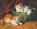
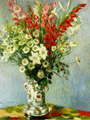
BEFORE beginning to paint portraits or figures from life, it is well to make preparatory studies of different objects — such as still life, drapery, flowers, etc.
Perhaps the studies most ready to hand, most available to the student who maybe in some way removed from the facilities of art study to be found in large cities, are those of still life. This term is understood to signify any inanimate object or objects arranged for artistic study and delineation.
As a means of study this arrangement may be coherent or incoherent; it may be meaningless or full of significance. We would, however, suggest that the student always invest this group of objects with the interest of logical proximity. For instance, an orange and an inkstand have nothing in common, while an inkstand, sealing-wax, pen and paper, have, as also has the orange on a plate with nuts and raisins. The orange and inkstand subjected to an effect of light and shade will serve all purposes of study, but they will always be incongruous and consequently uninteresting.
Studies of still life are capable of being treated with much artistic force and a lively pictorial interest. Splendid stuffs may be painted, rich and significant groups of varied tones and textures may be thrown together, making a pell-mell of gorgeous coloring that will excite the eye and stimulate the imagination. Some of the old masters appreciated the availability of such subjects by introducing large spaces of still life accessories into many of their important works.
In arranging studies for still life, seek for harmony of color, form, etc., and place objects so as to receive the most effective mass of light and shade. Try to express as faithfully as possible the various textures of the materials before you. Paint the hard objects so that they look hard, and the soft ones so that they may appear unmistakably soft.
All material things that are reasonably available as objects of study, may be used as models in this branch of art. None are too common, and many are full of beauty.
SOME SUBJECTS FOR STUDIES.
The following is an example of a still life composition which may be easily arranged : —
A small writing-table is covered with dark sapphire blue velvet or plush.
A little left of the center, and far back on the table, stands a large heavy crystal inkstand, set in a small Japanned tray.
Some sheets of very pale blue and creamy white note paper, with one or two envelopes, lie carelessly to the right, and partly in front of the inkstand.
On the left is a small brass candlestick, holding a white wax candle, and across its base are thrown a white quill, and a steel pen with polished black handle.
In the foreground to the left of the center is a small bronze ash holder, against which lies a stick of red sealingwax with one end resting on the table, and partly in front of the inkstand. On top of the writing paper is thrown an old envelope which has been opened, showing a large red seal partly broken.
The background to this study is a piece of Persian stuff of mixed colors, rich and harmonious in tone. This could be replaced by the wrong side of an Indian or broch shawl. This drapery hangs straight, as if on a wall or screen directly behind the table.
Let this study be placed in front of a window, a little to one side, and arranged with the end of the table toward the window. In this way the light and shade will be agreeably distributed.
In composing such a study it is important to avoid all appearance of stiffness and regularity. As a rule, the prominent central object should not be exactly in the m iddle of the canvas, but a little to one side. And it is important also that two objects of the same general size and height should not be placed equally distant from a central object.
The study is first sketched in with charcoal, and then outlined with burnt sienna and ivory black diluted with turpentine as already described.
A background of such mixed colors is treated in the following way :
Half closing the eyes, a general effect of color is obtained, in which for the moment the details of the pattern are obscured. We therefore lay in a first painting of warm gray with a pervading feeling of red and yellow.
For this, use raw umber, white, permanent blue, light red, yellow ochre, madder lake and ivory black.
Take out some of each color on the palette, and with the knife, rub them together a little, but not in one dead mass of uniform tone.
With a large bristle brush take up as much of this mixture as possible, using the brush somewhat in the manner of a shovel, and transfer it to the canvas, having put in a few drops of turpentine. Use the brush in short, rather quick strokes, not all in the same direction, but varying the touch agreeably, yet always so that the brush marks will not catch the light.
Proceed in this way until the background is covered with a gray tone, which suggests the general effect of the stuff, yet is without actual detail of any kind.
While drying, lay in the tablecloth.
For this dark sapphire blue mix Antwerp blue, silver white, and very little light cadmium, madder lake, ivory black and a little raw umber, Plush in this light will present almost one uniform tone of dark rich blue, with here and there soft silvery lights broken upon it. In the shadows thrown by the objects, this general tone becomes darker and warmer.
With a smaller bristle brush than that used for the background, the tablecloth is laid in, using the brush in very much the same way as before, yet working more carefully so as to preserve the drawing of the objects upon the table.
Paint the whole in one general tone, omitting the high lights and strongest shadows. These arc put in afterward, using a clean brush for the lights, for which mix silver white, Antwerp blue, a little cadmium, and madder lake with a little ivory black, letting the white and blue predominate.
Take up plenty of paint on the large bristle brush, and put it on crisply with firm touches, carefully studying the exact shape and location of the lights.
Do not attempt to blend or retouch, but drag the edges of the light a little over the general tone.
In this same way paint each object, laying in general tones at first, and putting on the lights and shadows afterward, proceeding to work up the details, and gradually carrying the whole toward completion in the manner described in the previous chapter.
To paint brass candle-sticks, mix for the general tone, light cadmium, yellow ochre, silver white, raw umber and a little ivory black.
In the shadows use yellow ochre, white, burnt sienna, raw umber, a little permanent blue and ivory black.
The high lights, which are put on with a small brush, are made with white cadmium, a little raw umber and a very little ivory black.
The white paper is painted first in a general tone of very light delicate creamy gray, using silver white, yellow ochre, a very little ivory black, permanent blue and light red. The high lights are then touched in sharply with silver white, qualified by a little yellow ochre and a mere touch of ivory black.
The colors used for the shadows are a little silver white, with yellow ochre, ivory black, permanent blue and light red.
Certain deep small touches occur in shadows which are called " accents," and these are always warmer and richer in color than the general shadow. For example, where one sheet of paper overlaps another, both being in shadow, a sharp, dark line is found beneath the upper sheet. Paint these accents with ivoryblack, burnt sienna and a little permanent blue.
In painting the glass inkstand, notice that the color of the transparent glass is affected by every object seen through it. For example, the background showing through the glass, in parts gives it a tone of warm gray somewhat lighter than the background itself, but partaking of the same colors.
The edges of the cut glass are very light, almost white. The little cup occupied by the ink in the center of the glass is clearly defined by a very dark tone of gray, almost black. The high light striking on the surface of the glass makes a spot of brilliant white on this dark gray, thus indicating the texture of the material. In painting this inkstand lay -in the part where the background shows through the glass with a general tone, using the colors given for the background, but using more black and white; then, while still fresh, take a very small flat brush and touch on the high lights along the edges of the cut glass. Use for these lights, white and a little yellow ochre, with a little ivory black, cobalt and light red. Make with these a very light gray tone and in the very highest lights use only white, yellow ochre, and a very little black.
Where the ink is seen through the glass, paint the very dark gray tone with ivory black, burnt sienna, a little permanent blue, and as much silver white as is necessary.
For the general painting of such an object, use flat bristle brushes about half an inch in width, taking the smallest size for half-tints and details. Use the flat pointed sables No. 5 for fine drawing and small touches in finishing.
The red sealing wax is painted with vermilion, light red, madder lake, white and a little ivory black for the general tone.
In the shadows use light red, madder lake, permanent blue, raw umber, a little ivory black and what white is needed.
Paint the deeper accents with burnt sienna and ivory black.
For the high lights, use vermilion, madder lake, white, a little yellow ochre, and enough ivory black to give quality.
In painting the bronze ash receiver, be careful to show the difference between that and the color of the brass candlestick. Lay in the bronze with a general tone made with yellow ochre, white, raw umber, burnt sienna, and a little ivory black. In the shadows use the same colors, but add a little permanent blue. Paint the high lights with yellow ochre, white, raw umber, and ivory black.
The pale blue paper is painted with permanent blue, white, a little ivory black, and light red. In the shadows use the same colors, but substitute burnt sienna for light red and add raw umber.
All the objects being laid in, giving the general effect of the whole, we return to the background and finish that.
If there is an elaborate pattern in the material it must be treated in the following manner :
The most prominent part, that which most attracts the eye, is taken up, and with small brushes, that portion of the design is carefully painted in detail, using the medium gray already laid in as a ground work.
This part being carefully painted, the rest is merely suggested, by touches of color following the general direction of the design yet without attempting to go much into detail.
In the deep shadow, the background presents almost one flat, even tone, with rich touches of color broken in occasionally in the part nearest the light. The highest light on the background is also kept simple without much detail.
The background must be managed so as not to attract too much attention, as the principal interest should be centered in the subject itself.
Some other interesting still life studies are — some old books, one lying open, the others carelessly arranged with strong effect of light and shade.
Another subject is a stone jug and glass half full of beer, with plate of crackers and cheese.
Another, a string of fish, and copper kettle, also oysters on the half shell, arranged on a plate, and a wine glass of sherry.
A beautiful study of color is found in vegetables of different kinds. Take, for example, a green cabbage, some red tomatoes, beets, large yellow crooked-necked
squashes, cucumbers, and feathery herbs ; arrange them on a pine table, with a dark, rich gray wall, partly in shadow, for a background. Let a tall gray and blue jar stand far back, the vegetables piled in front, and you have a most interesting subject.
Bric-a-brac, rich pottery and drapery furnish picturesque still life compositions. In fact any objects that attract and please the eye in nature and suggest agreeable combinations of color may be utilized for such studies.
In painting still life subjects it should be remembered that one great charm of such pictures is their realism. This quality is only obtained by closely studying nature and interpreting as truthfully as possible each object in its proper value.
VALUES OF OIL PAINTING
The term "value" is used in art to express the comparative relation of tones to each other irrespective of color.
A picture may be in monochrome or drawn in black and white, yet contain many different values, while in another case several objects of different colors may chance to be of the same value.
In a study of still life, for example, when laying in the general effect, we carefully observe the background in relation to the objects in front, and notice which is darker, the background or the table? and again compare each object in turn with the others near it, so that their exact relation may be ascertained.
This study of values is one of the most important things in art, as upon the correctness of the values in a picture depends its truth to nature.
PART SECOND.
CHAPTER VI.
PORTRAIT PAINTING.
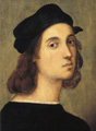
NO department of painting is more interesting or more deserving of faithful study than the delineation of the human face. It is the seat of human character ; and the temperament, habit, tendency of thought, and even the vicissitudes of life are already painted there in the head of the sitter to be deciphered and interpreted by the artist in such just proportion that a living representation of the person shall be the result.
Now, to do this effectually and effectively, there are many things to be considered, of a practical kind, that may aid
the painter in his task, the ignorance of which would only multiply difficulties and contribute greatly to failure.
THE LIGHT OF OIL PAINTING
The arrangement of the light is naturally of prime importance ; for it is very easy through any unfamiliar or exaggerated condition of light to considerably change the natural aspect of the person subjected to it, and in some studios where the light comes too directly from above this is likely to be the result.
This mode of lighting gives picturesque effects of light and shade below ; but for portrait painting it is undesirable, as it causes too abrupt and heavy shadows under the eyes, nose, and chin.
If the studio have both top light and high side light, curtain the top light, and place the subject so as to receive a broad effect of the side light. This arrangement will produce a very agreeable balance of light and shade, and with nothing so unusual in it as to cause comment of its effect upon the sitter. Unless it is thought best in order to bring out certain desirable characteristics, do not pose the head so as to receive much shadow. The most satisfactory portraits, generally speaking, are those posed in rather a full light. This suggestion is well worth giving attention to, as it is the tendency of the inexperienced to arrange a strong effect of light and shade when beginning a portrait.
POSING A SITTER.
In posing a sitter one should be careful not to place him or her too high ; a good rule is that your own head, while working, and that of the person painted should be on about the same level.
If the portrait is to be half-length or a bust merely, a chair placed on the modeltable will be in good relation to the artist, if he stands, and it is best to stand when possible, for it gives one much greater freedom in working. To be able with ease to step backward in order to see the effect of the touches is a great advantage.
So advantageous, indeed, is this manner of working that many artists never sit while painting.
The attitude to be chosen for a portrait is a matter that should be left entirely with the artist ; and we would suggest that the simplest poses are always the safest. An accidental or transient position should only be attempted by a master, while for the beginner, or those having little experience, it is well to wait and see what nature will do to help one out. Engage the sitter in casual conversation while preparing canvas, charcoal, and other material, and it will be more than likely that some hint will be caught in the turn of head or disposition of hands that will be of value in the ultimate arrangement. This arrangement must not look too much " arranged," for it is here that one advantage of portrait painting over photography exists — the intelligence of the painter is counted upon to catch something charac* teristic, life-like, and artistic.
A fact that would be well to bear in mind is that the nose as looked at from the two different sides of the three-quarter view, frequently presents a totally different appearance. This is owing to the irregularity of the cartilages, which in some cases vary considerably. From one side the nose may be really fine, while from the other commonplace or ugly.
The handsomer side should of course be taken, and with no fear of falling into the unfamiliar, as both sides are characteristic.
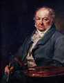
ACCESSORIES OF OIL PAINTING
Whatever contributes to the beauty and interest of a portrait beyond the face, or in fact whatever is introduced into the area of the space represented in a portrait aside from the subject itself, may be called accessories. These, it is needless to state, should always in a well conditioned portrait add to its effectiveness as a picture. The artist indeed might be said to be known by his accessories, for it is certainly no strong indication of his intelligence or of his taste, when he chooses to present a hatless old gentleman in a broadcloth coat, standing with one hand resting on a cloth-covered table, while behind him spreads a valley with a winding river, beyond which are seen looming the snow-clad Rocky Mountains. All this incongruity and villainous art, because perhaps, the distinguished subject happens to be the president of some overland railway.
The accessories of a portrait should always be fitting ; the right thing in the right place. Even the choice of dress should be left largely with the painter, for he knows what color he wishes to predominate in his canvas. No costume in a portrait should be so obtrusive as to detract from the head.
With a man's portrait this question of costume is of less importance, as man's modern dress is sober in color, and in a painting, if properly managed, need never be an offense. But whatever other objects are made use of, a chair, table, bookshelves, curtain, etc., these should always be chosen with a view to their color and appropriateness in relation to the character and complexion of the person to be painted.
COMPOSITION OF OIL PAINTING
It is not generally appreciated that the element of what is called composition enters largely into the making of a portrait. Composition is supposed to belong only to those departments of painting known as " genre," or historical or landscape. Nothing could be further from the mark, for composition has to do with every branch of artistic effort ; it is indeed one of the most cogent qualities that entitles a picture to be called a work of art. It is the art that conceals art, but which is always and necessarily there.
In portraiture, composition is to be found, if looked for, in the adjustment of the figure to its surroundings, so that the spaces of the canvas not occupied by the figure itself may not be without interest, but unobtrusively lend their aid in directing the attention to the purpose of the work which is to represent a human being in a familiar and natural environment. To do this well is to achieve much, although it might be at first looked upon as an ordinary and unimportant accomplishment.
In endeavoring to effect this desirable end, let the student first of all give special attention to the position of the head upon the canvas. It should be neither too high nor too low. If in a bust portrait, the first error will tend to make the lower half of the canvas uninteresting, revealing a mass of dress which will outbalance the head ; and the second mistake disturbs the interest by causing too great an area of background to display itself, and by giving an undignified suggestion of the figure sinking altogether out of the frame.
If it is a question of a portrait in profile, in addition to the above points care should be taken to leave somewhat more space in front of the head than is left behind it. Failure to do this is an evidence of bad taste, and detracts from the proper balance or composition of the work.
These directions should be followed in regard to whatever objects may be introduced as accessories to the portrait, for it should be remembered that the skillful composition of a picture is an expression of the taste and intelligence of the painter.
Avoid repetition of lines or spaces when they do not serve some logical purpose. Vary as much as is consistent with simplicity and naturalness the position of the arms, shoulders, and hands, so that there shall be no danger of their suggesting geometrical exactitude of line. It is surprising how prone one is to repeat the direction of lines in arranging a composition.
The folds of a dress, or the lines of a shawl or scarf, may make or mar the composition of a portrait. Every thing depends on the use made of such natural and legitimate material as is at hand.
It is not necessary to go outside of the question and drag into the picture some irrelevant object to contribute to the richness of the composition. Remember that the most fitting is always the best.
EXPRESSION OF OIL PAINTING
We now come to the subject of expression in portraiture, and this has a much larger significance than would at first be fancied on giving it but a casual thought.
It is not merely in the subtle and evasive lines in the face, the close study and observation of which help so greatly to emphasize the likeness, that expression entirely consists, although these contribute much to its realization ; but there are other attributes of personality to be considered, wherein lurk sometimes strong elements of characterization not to be overlooked, be the head itself never so well finished.
There is much in the hands that is expressive of the character, occupation, or temperament, and to so treat them that they may be individual, personal, and forceful enough to suggest that they belong to the head of the sitter and to none other, is to emphasize the expression of your portrait.
The nervous or nerveless manner of holding the head, the stolid, phlegmatic way of sitting, or the stately and spirited carriage and bearing to be found in one sitter or another, are all qualities which, if stamped upon the portrait, add greatly to the force of its expression.
In painting a portrait the artist does not attempt to get the expression during the first sitting, but after he has correctly drawn in the features, and general character of the head, and has the color well laid in and partly modeled, then it is he begins to look for the expression of the face.
This is not accomplished all at once, but in certain touches here and there, added at moments when the sitter has forgotten he is being looked at, for the consciousness that he is painted will often produce a constrained and unnatural expression. It is therefore better not to mention just what part of the face one is working on at the moment.
There are certain muscles which by their action produce the changes of line and form in the face that influence the expression.
If these changes are carefully studied, it will become comparatively easy to render different expressions in painting.
To make an eye bright and animated, a dark accent is added under the upper lid, giving it more of an arch, a touch of brilliant light given to the iris and eyeball, and the pupil darkened.
A sad and pensive expression is produced by drooping the upper lids, shading the white of the eye deeply under the lashes, and omitting the sparkling high light.
The effect of tears is suggested by adding a slender line of light on the eyeball just above the lower lid, extending from the outer corner almost to the iris. The white of the eye must previously be painted in a tone of soft gray.
In a smiling face, the eyes are rather widely opened and the under lid raised higher in the center than at the corners.
The lines of the nostrils also influence this expression, and become elevated at the outer edges, while in a face that is sad or depressed, the nostrils will droop.
The mouth is considered to be the most important feature of all in regard to the expression. This can be easily seen by an old test ; covering all the face, showing only the eyes, and it will be almost impossible to tell whether the expression is a smile or a frown. If the mouth alone is exposed, there is no difficulty in making the decision. When smiling, the corners of the mouth turn upward, the lips part slightly, and the lines or dimples at either side curve outward. To express sorrow, the corners droop, the lips close and the lines become straight and severe.
These general rules are merely given as guides and are not intended to be arbitrary, for of course in each face such conditions may alter somewhat, according to the individuality exhibited.
BACKGROUNDS OF OIL PAINTING
The background of a portrait is a serious consideration to the painter ; its influence is most important upon the picture, as an inharmonious or inappropriate background may greatly impair the effect of work that is in other respects, good.
Certain colors affect so materially the aspect of the flesh that great care should be taken in their selection.
For example, in painting a baby, or very young child, all heavy, somber tones should be avoided in the background, as well as colors that are too striking and brilliant.
A delicate pearly gray, or pale, dainty green, suggestive of a spring landscape, will make a charming relief for a very youthful face, as these tones harmonize delightfully with the pink and white of baby flesh.
In a full-length portrait the background may assume a more realistic form, such as a portiere, curtain or wall ; if the canvas is very large, and there are accessories, it is well to arrange the person to be painted as nearly as possible in the midst of the objects to be used as accessories. It is also well to place behind the sitter the piece of stuff or tone of wall you intend to paint, as it greatly adds to the force of a work to be thoroughly truthful in the interpretation of these values.
It is no easy matter to keep the background in its place, for in some portraits it is a misnomer to call a background that which, although intended as such, would more appropriately figure as a foreground.
This comes from its want of a quality of atmosphere which may be secured by a faithful study of the relation of the head to the tone and color behind it. Some
painters try to compose from imagination backgrounds which will harmonize with the head, but find great trouble attaining a satisfactory result. It is not a method to be recommended, and certainly never to a beginner.
In painting a bust portrait, or one in which only the head and shoulders appear, the background should be kept as simple as possible, and no accessories of any kind admitted.
If any material is simulated, such as a plush or velvet curtain or porti&re, do not paint all the folds in a realistic manner so as actually to suggest a curtain, but use the material merely as a tone to relieve the head, suggesting aflat wall or screen.
A shadow thrown behind the head and shoulders, falling somewhat to one side, is sometimes very useful in giving relief, and detaching the head from the background; this should, of course, be in logical relation to the general effect of light in the picture.
A half-length portrait in which the hands are shown may have a more elaborate background than is desirable for the head only.
Some beautiful effects are produced by the use of Madras muslin with many differently colored designs upon it, all in faint, delicate tones. This comes in many varieties, and is arranged behind the figure without folds. The figures are painted somewhat in detail in the most prominent parts, while the rest is merely suggested in a broad way.
Such backgrounds must always be kept subservient to the figure, and the details should always be made less distinct than they actually appear.
As a rule the background should never be exactly the same value as the flesh, but either darker or lighter in its general effect.
In portraits of three-quarter length, accessories may be introduced with good effect, if desired, though some well-known portrait painters always prefer to keep the background one simple tone, no matter how large the picture. Such a matter may be decided by the individual taste of the painter.
In full-length portraits a perfectly simple background is very difficult to manage, so as to have the proper atmospheric effect and to preserve the interest of the picture.
In such cases the canvas should not be any larger than necessary to give the figure room.
When accessories are composed with the figure, a larger canvas is required, and when such objects are carefully arranged the portrait can hardly fail to gain in interest, especially if life size.
Great care should be taken in placing the full length figure upon the canvas. Too much space in front of the feet will throw the figure back, so that it will appear to be distant from the spectator, and too little space places the figure too far forward, almost in front of the frame.
This perspective must be taken into consideration and the space regulated so that the person painted stands or sits a little back in the imaginary room, and well inside the frame.
The space underfoot and in front of the figure must be painted to represent a floor of some kind. A Turkish or Persian rug is effective, and a parquet, where the boards are indicated, gives a suggestion of space and atmosphere.
With such a foreground, a full sweeping porti&re of rich, heavy material, such as plush cloth or tapestry, forms an appropriate background, and a tall jar or vase holding grasses, flowers, or peacocks' feathers, composes well in this connection.
In order to avoid a perfectly straight line for the floor, pull the drapery of the portiere forward on one side, letting the end lie on the floor in irregular folds, reaching almost to the bottom of the canvas.
In painting an out of-door background to a picture it is well to have made some studies of flesh in the open air for a guide to the values, as the effect of light is very different from that of the ordinary studio, as previously suggested. A made-up landscape background with the figure painted in the conventional studio light, is not good art, and is immediately detected by any one with art knowledge. For this reason we would advise the beginner to confine himself to the logical effects within his reach in the studio until he has gained sufficient experience to justify experiments.
Some examples of conventional backgrounds are here given which may be found useful.
A very light, delicate, silvery blue, qualified by grays, is suitable for a baby's head, or young child with golden hair and very fair complexion. This is painted with permanent blue or cobalt, silver white, a very little light cadmium, madder lake, and enough ivory black to give quality.
A tone of warm light gray, varying in quality according to the complexion, may be used where the hair is light, or dark brown, or even black.
Use for this yellow ochre, silver white, light red, ivory black and permanent blue, adding madder lake in the cooler tones, and raw umber for a warmer quality. A rich, dark crimson is sometimes very effective for a background, especially for a person with florid complexion, and also goes well with black hair and brilliant colors.
Lay this in with madder lake and bone brown, and a little ivory black, using turpentine for the first painting.
When thoroughly dry, oil it out and re-paint, using madder lake, ivory black, bone brown, and a very little permanent blue with a very little white, if needed, in the darker parts. In the lighter tones, use madder lake, vermilion, ivory black, and white. Use plenty of paint, putting it on thickly with large, flat bristle brushes.
After the first painting, mix with the paint a little poppy oil and siccatif de Courtray in the proportion of one drop of siccative to five of oil : this is done to make the color dry, as madder lake and bone brown dry very slowly where large quantities are used.
A very useful background for many purposes is a tone of warm gray green, growing rich and dark in the shadows. This is made with Antwerp blue, burnt sienna, white, raw umber, ivory black and yellow ochre. In the lighter, cooler tones add madder lake.
A tone of amber or old gold, largely qualified by grays, makes a very striking background for a rich, dark complexion and black hair.
This is painted with yellow ochre, white, raw umber, burnt sienna, and ivory black.
In the lighter parts, deep cadmium may be used, and in the deeper tones a little permanent blue is added.
Such a background is painted loosely, that is to say, not in one flat, hard, even tone, but the colors are put on the canvas without too much previous mixing, especially in the darker parts and shadows, where touches of blue, red, yellow, etc., are put on and only softened enough to make a general harmonious effect of color.
Another excellent background, and one which gives color and interest, is a tone of rich deep sapphire blue. This is especially good with iron gray hair, and rather warm complexion.
To paint this, use Antwerp blue, white, a little madder lake, ivory black, raw umber, and a little cadmium, adding yellow ochre and burnt sienna in the darker parts.
A good tone of rich, warm brown is useful for gentlemen's portraits. This is also largely qualified with grays, and is painted with bone brown, yellow ochre, white, burnt sienna, ivory black, with permanent blue added in the cooler gray half-tints.
Such a background is employed by Bonnat, the celebrated French portrait painter, in nearly all his portraits. He makes it appear like a shadowy distance by using the blue-gray tones with the brown to give atmosphere behind the head.
Another well-known French artist, Chaplin, uses almost invariably a tone of light gray made apparently of every color of the rainbow, put on in touches somewhat like mother-of-pearl in effect.
These men are such masters of their art that they can afford to be peculiar. It is not well to follow such mannerisms, however, as in other hands they become mere imitations and lose their character.
Carolus Duran, the great cblorist and famous portrait painter, is most realistic in all his effects. His favorite backgrounds are the velvet and plush portieres already mentioned, with rich rugs on the floor combined with some simple and appropriate accessories.
In bust portraits, where only a simple tone is used, he is always careful to place the exact color of the background behind the head of the sitter while painting, so that the values may be correctly studied. As has already been suggested, this is an excellent method and should be closely followed by the student.
CHAPTER VII.
DRAPERY.
TO the student who has given most of his time to the study of the figure only, the painting of drapery will at first seem to be of little importance, and he may think indeed, that its difficulties are slight. The management of drapery really demands a great deal of the attention of the artist, as it plays no inconsiderable part in the art productions of the day, while it is absolutely necessary for the portrait painter thoroughly to understand it.
One of the great testimonies to the thoroughness of many of the old masters in their profession, is the marvelous manner in which they introduce, make use of, and manage all accessories of drapery, whether upon figures, serving the purposes of backgrounds, or trailing in some splendid and artful line on balustrade or balcony, a valuable and indispensable factor in the composition.
This they could not do, if they were not masters of that as well as of other resources of their art, and yet we frequently see, at present, a fairly painted head in a badly painted coat or dress.
There are draperies that have been treated in so masterly a manner as to become historical, and there are many lovers of art as well as artists to whom the flowing red robes in Titian's Assumption, the vigorously painted garments in many of Tintoretto's canvases, the splendor of figured brocades and satins in the pictures of Paul Veronese, and the richly draped portraits of Rubens and Velasquez are distinct and pleasure-giving memories.
In all portraits, the costumes should be appropriate to the age, condition, and surroundings of the person painted.
As the personality of the individual is the most important consideration, the draping should never be allowed to detract from this in any way. No one part of the costume should be so well painted as to attract particular attention ; for example, if a fine lace collar surrounds the neck, do not imitate the lace so well that it will be noticed before the face. A fan, a shawl, a bouquet, may be so elaborated that the beholder sees this only. Such portrait painting becomes simply a still life study, in which the face and figure are merely accessories.
The costume should be simply and broadly painted, with only enough detail to give interest and relieve the flesh.
Avoid crude and brilliant colors.
Babies should always be dressed in white, which maybe relieved by light blue or pink, in the shape of ribbons, sashes, or other accessories.
For older children, black velvet is very handsome relieved with lace ; costumes of solid gray, blue, and crimson velvet, plush, or silk, are also appropriate.
•Such colors as bright green, red, yellow, and purple, should not be used in ordinary portraits.
If such color is needed, it is better to put it in the background or in the accessories than in the figure. On middle-aged women, black, gray, fawn color, or white dresses always look well, though in special cases more striking colors may be used with good effect, if well managed.
An aged lady with white hair is beautiful in black velvet, satin or silk, arranged with lace or simple white tulle.
If the person has never worn such rich materials, it is better to paint the style of dress made familiar by habit, as any unusual surroundings will detract from the familiarity of the likeness. It is also well to avoid all unusual and exaggerated styles in the fashion of hair or dress, if possible.
In painting various materials, the difference in texture between silk, satin, velvet, plush, cloth, etc., is indicated by the peculiar manner in which the light falls upon the surface of each. In satin, the lights are crisp, sharp, and very brilliant ; on silk this effect is much modified, as the high lights are not so bright nor are the shadows so very dark as in the satin.
In cloth, the lights are entirely different in character, being very dull and broad, and generally diffused over the surface of the material, as well as very much lower in tone, while the shadows are not nearly so deep as in silk or satin.
In velvet again, the lights, while bright, yet melt softly into the half-tint, and the shadows are very dark and broad. In plush the soft, diffused lights of the velvet are transformed into broken, crumbly touches, suggestive of the long silken pile.
TRANSPARENT MATERIALS, LACE, ETC.
TO paint lace, thin muslin, or any such transparent material in which the flesh will show through, seems at first a very difficult task, but in reality, when the principle is once understood it will be found a comparatively simple matter.
To better explain, we will take for example a dress of fine white muslin very transparent in texture, worn by a young girl over a blue silk bodice with short sleeves and low neck, showing the flesh through the muslin.
In the first place, notice where the muslin covers the neck that the tone is a light grayish pink or flesh color, lighter and grayer than the actual flesh. Further down where the blue silk bodice is seen through, the color changes to a light grayish blue, partaking of the color of the silk, but lighter and grayer in quality.
In the same way the sleeves are painted, laying in a general tone with the colors used for painting the flesh, but making it lighter and grayer, as for the neck. After laying in the effect of the muslin over the flesh and silk in this simple way, the presence of the muslin is further made apparent by painting at the edges of the shoulders, arms, and other outlines, a soft line of light gray so light as to be almost white, and entirely uninfluenced by the color beneath ; this is dragged a little over the undertone and softened till it gradually loses itself, while remaining clear and sharp at the outside edges. A few fine sharp white lights are also put on over the tones already laid in both for the neck and bodice : these are to indicate the folds of the muslin.
In painting lace or figured muslin, the principle is the same ; the general effect is laid in at first in the simple flat tones already described, the details being entirely left till a later painting, and the folds being indicated exactly as if the material were plain transparent muslin.
The pattern of the lace is finally painted thus : take up a part of the lace which is the most prominently seen, and carefully draw in detail with small brushes the outline of the figures, using the first painting as an undertone, and putting in the high lights in the form of the pattern, while directly under each light look for the sharp dark accent. of shadow which defines it, and paint it in with the small pointed brush.
When this careful work is done for a small space, let the touches be less exact and more suggestive, though still following the general character of the pattern. In the more remote portions, very little detail is necessary beyond an occasional hint of the figures, shown by touches of light and dark in the half-tints ; the large masses of shadow and light must be kept quite simple.
In painting dark, transparent materials, such as gauzes or lace, the same principle is observed but the conditions are reversed.
Black gauze over flesh is laid in with the colors used for the flesh, but in a darker, grayer tone. The folds which suggest the material should be fine, sharp lines of dark crossing the under painting, and the tones at the edges are dark also instead of light.
A gray surface light will also be seen on these folds, which will indicate the texture of the gauze.
With these suggestions as a guide, the student should practice painting various draperies, arranging his studies from the actual materials, and familiarizing himself with the different stuffs which will enter into the composition of his pictures. In this way he will also learn to observe that by the size of the folds, and their manner of hanging, the thickness and general character of such draperies are indicated, a matter that is frequently slighted, yet which is of great importance,
CHAPTER VIII.
MANNER OF PAINTING A PORTRAIT J COLORS FOR FLESH, HAIR, ETC.
WE now come to the actual painting of the portrait.
In selecting a canvas always get the best, and have it well stretched. One that is neither too smooth nor too rough is also advisable, and be careful to have the size conveniently adapted to the composition, as, if too large, the space around a figure is awkward to manage, while too small a canvas gives a contracted and insignificant effect to the portrait.
Winsor & Newton's single primed English canvas is of an excellent quality for portraits, having just sufficient roughness of texture to take the color well. The twilled canvas is also used a great deal, but is more expensive, and is in reality no better than the plain, the choice being merely a matter of taste.
A good size for a child's bust portrait or for a female head and shoulders, is 17x21. If much of the body is shown, a larger size is better.
For a man's head a larger canvas is desirable. The sizes may range from 18x22 to 20x24, f° r a M e size bust portrait without the hands.
Before ordering the canvas for an important portrait of any large size, such as the quarter, or full length, it is a good plan to arrange the composition and sketch it in roughly on large sheets of paper pasted together, or on a blank wall, with charcoal, and then by drawing a line all around it with the charcoal it is easy to determine just what the size of the canvas should be.
All preliminaries having been arranged, and the sitter placed in a good light, the first step is to draw in the portrait. This is done with charcoal : a stick of medium French charcoal is sharpened to a point, and the outline and general proportions of the head and shoulders lightly sketched in upon the canvas.
The student is urged to confine his portrait studies to the head and bust only until he has thoroughly mastered that most difficult thing in Art, the painting of the human face.
The varieties in complexion, hair, expression, features, found in the different types of faces, and the influence of certain backgrounds upon the flesh will all be found of absorbing interest to one that has in him the real love of Art.
It is of great importance that the student should have a good foundation in drawing before beginning to paint from life, for painting is really drawing with the brush, and without the necessary training it will be found impossible to succeed.
The drawing of the head in charcoal upon the canvas should be made as correct as possible before beginning to paint ; if therefore some should find it difficult
to make as careful a drawing as desired, on account of the texture of the canvas, a good plan is to make the drawing first upon paper with the charcoal, and then to transfer it to the canvas.
A drawing is transferred in the following way : The back of the paper upon which the drawing is made is "scribbled" all over with charcoal, until it is entirely covered: this is now laid upon the canvas with the charcoal downward. Care must be taken to place the drawing in the right position on the canvas, where it should be fastened with paper tacks or pins so that it can not slip.
With a fine steel knitting needle or hard lead pencil point, the outline of the head and face is carefully gone over, omitting nothing : on raising the paper a perfect outline of the drawing will be found upon the canvas. This should be secured at once by spraying fixative through an atomizer, or by going all over it with a pencil, as the charcoal rubs off very easily.
The drawing, when made directly upon canvas, had also better be sprayed with fixative after shaking off the superfluous particles of charcoal, as it makes it more secure.
The next step is to lay in the outline and general shadows in a reddish brown tone, made with burnt sienna and ivory black, mixed with spirits of turpentine.
Use a small, pointed sable brush for the outline and details, and with a medium sized bristle brush lay in the shadows in one flat even tone without any reflected lights.
The form of each shadow where it meets the light must be carefully studied and distinctly indicated.
The canvas is left uncovered in the lights, which are also kept simple. The effect of this is to divide the whole head into two simple masses of light and shade without half-tints or other modeling.
The turpentine is used to thin the paint, and will also cause it to dry quickly.
After the drawing is secured in this way, which is called the " frotte," the background is next taken up ; then the hair, draping, etc., leaving the painting of the flesh until the last, as it is better to have the surroundings all laid in first, so that their influence on the flesh may be understood.
In painting the background, always put the paint on thickly with a large bristle brush, and mix a little turpentine with the first painting.
If there is any detail or elaboration in the background, leave it until a later painting, putting in only a general tone at first, though of the proper value in relation to the figure.
The hair is laid in in simple flat masses of light and shade, but with careful attention to the exact shape of the lights and shadows, as these determine the character of the hair, whether it be smooth or rough, curly or braided. In smooth dark hair, the lights are very bright and broad, while the shadows are rich and dark.
In dark hair which is curly, the lights are broken up into small bright touches, with strong sharp dark accents of shadow tyy ; , beneath.
In light hair the lights are much less brilliant and the shadows not so dark.
If the hair be smooth the lights are broad, though duller than in dark hair, while if curly, the same character is seen in the lights and form of the shadows as in curly dark hair, though the lights are less brilliant and the shadows not so strong.
The colors used in painting hair are as follows.
For black hair take ivory black, madder lake, and yellow ochre, with burnt sienna and a little cobalt blue in the shadows, adding whatever silver white is needed, to lighten the tones.
Dark and brown hair is painted with bone brown, ivory black, madder lake, yellow ochre, and white for the general tone, adding burnt sienna in the shadows.
The half-tints are made by adding cobalt blue and silver white.
In reddish brown hair, use burnt sienna, raw umber, ivory black, a little cobalt blue, and white. In the shadows, omit the raw umber, and in the lights add yellow ochre if necessary.
Red hair, reddish gold, or very light reddish brown hair is painted with light red, silver white, yellow ochre, raw umber and ivory black ; adding cobalt blue and burnt sienna, in the shadows. In the lights omit raw umber.
The half-tints are made with light red, white, cobalt blue and ivory black.
According to the tone of the hair, vary the proportions of the colors ; using more yellow ochre and white if the hair is light, and if dark, more black and burnt sienna.
To paint light yellow, golden or blonde hair, use yellow ochre, silver white, raw umber and ivory black for the general tones. In the shadows, use burnt sienna, ivory black, raw umber, and a very little cobalt blue with white.
Paint the half-tints with ivory black, white, a little cobalt blue, light red, and raw umber.
In the lights use yellow ochre, white, and a little ivory black.
Let me say here that ivory black should always be used with care. Generally only a little is needed to give the beautiful quality of gray so essential in painting, while too much will make the colors dingy and dirty. Always begin with a very little in mixing tones, and add more as it is needed.
To paint gray hair, use silver white, yellow ochre, raw umber, and ivory black, with burnt sienna and cobalt blue in the shadows. According to the quality of gray, use more or less yellow or black.
Silvery white hair is painted with silver white, yellow ochre, a little light red, cobalt blue, and ivory black for the general tone, which is first laid in. The lights are put in afterward, using silver white, a little yellow ochre, and a little ivory black.
For the shadows use ivory black, white, a little madder lake, light red, cobalt blue, and yellow ochre ; in the deeper accents use burnt sienna, ivory black, and cobalt blue.
When ready to paint the face, the palette should be cleaned off in the middle, leaving only the outside row of colors along the edge. The second row mixed with white, as already described in the earlier pages of this book, should be freshly arranged.
Put out plenty of each color, as the first painting must be laid on thickly, a little turpentine being used as a medium.
We will take, for example, a female head, of medium complexion, neither very fair nor very dark.
Having already laid in the background, hair and dress, the head being carefully drawn with burnt sienna and black, we begin with the light mass of the face, and proceed to lay in a medium tint of flesh color, which is not the highest light, but, let us say, will about match the tone around the mouth and chin.
For this use silver white, yellow ochre, vermilion, madder lake, light red, a little raw umber, with a little ivory black and cobalt.
Begin with the forehead, and, taking up the color with a large flat bristle brush, paint with rather short strokes, carrying this same tone downward all over the temple, cheek, jaw, nose, upper lip, and chin, till we meet the edges of the shadows, leaving out the eyes and lips just at first.
Remember to use the brush in the manner of a shovel when taking the color up from the palette, and do not try to smooth away all the brush marks, but leave them as they chance to come, unless they catch the light too much by showing little ridges. In this case reverse the movement of the brush, letting the touches take an opposite direction.
The manner of handling the brush must be learned by experience. One suggestion we offer is, to let the movement follow somewhat the forms of the face.
For instance ; downward touches on the bridge of the nose, turning naturally around at the end and across the nostrils. The sweep of the jaw is followed by the brush, which . would then turn slightly around the curve of the cheek, taking a straighter touch at the cheek-bone, beneath the eye, and so on.
It is impossible to give fixed rules for such a matter, as each artist handles his brush as best suits himself, some acquiring great skill and cleverness in its manipulation.
The lips are also painted in a flat tone at first, using vermilion, madder lake, white, light red, raw umber, yellow ochre, and ivory black.
Having thus laid in the light mass of the face, we proceed to the shadows.
Mix for this a medium tone which is not equal to the darkest touches, and yet will represent the general impression of the shadow.
Use raw umber, light red, yellow ochre, cobalt, ivory black, madder lake, and as much silver white as is necessary.
Taking up plenty of color on the brush lay this shadow in with one flat, even tone, without accents or reflected lights. Take a clean, large bristle brush for the large shadows, and for the smaller masses, such as around the nose, over the eye, the chin, etc., try a smaller sized brush of the same kind.
Let this tone exactly meet the light but without running into it, preserving carefully the shape of each shadow where it comes in contact with the lighter mass. This is of the utmost importance, for the forms of the shadows determine the character of the features ; and the likeness depends upon the truth with which they are studied.
The whole head being laid in in two simple masses of light and shade, we proceed to treat the neck and shoulders in the same way. The same colors are
used as for the face, but in a little different proportion, as the flesh on the throat is a little yellower than the face, while the general tone of the shoulders is more like ivory, having less red and raw umber, but more yellow ochre and cobalt and ivory black.
Turpentine having been used with the colors for this first painting, it dries very quickly, so that when we have finished laying in the shoulders we find the face partly dry. Before leaving it, take a clean, medium-sized flat bristle brush, and soften together the edges of the light and shadow, not blending, but merely uniting the two masses of color so that when dry there shall be no line of separation or glimpses of bare canvas seen between, as such places are sometimes difficult to cover nicely.
This first painting is allowed to dry thoroughly before any thing more is done to the portrait. Put the canvas in a warm, dry place, near a stove, or where it can have the sun and air.
For this reason it is well to have more than one canvas on hand at the sanie time, so as to let one dry while working on the other.
A few days is actually sufficient for this first painting to dry, though a few weeks is much better if one can spare the time to wait.
The reason is this : if the under painting is not very dry, the colors of the subsequent painting will sink in and be partly absorbed, thus losing their brilliancy and becoming dull. A good hard, dry foundation, however, will bear up the colors, preserving the freshness and subtlety of the tones put on by the painter.
The first painting having been allowed to dry sufficiently, is scraped down with a sharp palette knife or scraper, before beginning the second painting. The manner of doing this has been previously mentioned in relation to preparing canvas, but we will recall here the more important points. The knife or scraper should be held with as much of the blade as possible resting lengthwise against the canvas, and at right angles.
The least sloping of the blade or inclination either way will slice off the paint and possibly cut the canvas. Holding the knife firmly in this way, move it in regular downward strokes, but not back and forth. A little practice will enable one to do this very easily, and its effect is to remove all the obtrusive roughnesses without apparently eliminating or obliterating the brush marks.
An old razor is sometimes used for this purpose but must be very carefully handled, and if the paint has been put on very thickly fine sand-paper may be employed, as previously described.
Before painting again the canvas is oiled with poppy oil, then wiped off with a clean rag.
Having set the palette freshly, we take up the second painting of the head. Beginning with the forehead, we add the halftints, between the shadows and the lights, re-painting also the adjacent portion of the shadow and light on either side of the halftint.
This tint is a soft, warm, delicate gray, made with silver white, light red, yellow ochre, with a little ivory black and cobalt.
After painting the half-tint in its proper value, take a dry brush and drag the edges of the half-tint into the shadow, and the light into the half-tint. The high light on the forehead is put on with a full brush, using silver white, yellow ochre, vermilion, and a very little ivory black, taking care to have the surrounding tones fresh.
The eyes are next taken up and a tone of dark warm gray put in for the eyebrows, over which the effect of the hair is painted afterward.
The soft color over the eyes and under the brow is a little darker and grayer than the local flesh tint, with which the face is covered, and verges on blue and purple toward the temple, growing redder and darker toward the nose.
Use for the undertone of the eyebrows raw umber, light red, white, cobalt, and a little ivory black. Into this paint the eyebrows in their general form as a whole, not attempting to show the distinct hairs, using raw umber, burnt sienna, ivory black, white, and cobalt blue.
Paint the eyelid and tone over the eye with yellow ochre, white, light red, cobalt, madder lake, and a little ivory black, adding burnt sienna and raw umber in the warmer and darker parts.
Now lay in the white of the eye in one general tone of bluish gray, using in proper proportions, white, light red, yellow ochre, cobalt, and ivory black. The high light is put in with a flat pointed sable brush — No. 5, forming a small brilliant touch of light, which is not blended or softened. Use white, qualified by a little yellow ochre, and a very little ivory black.
The iris is laid in in one flat tone at first, into which the details are then painted ; the pupil is made very dark and rich with ivory black and burnt sienna, or
if very brilliant, with a little madder lake and cobalt added to the ivory black instead of burnt sienna. The small bright touch of high light is added, also the reflected light, which gives a lighter color to one side of the iris.
A darker shade is seen immediately under the eyelid, which extends across both iris and eyeball. This softens and unites them, and prevents the effect of a hard circle of color sharply outlined against the white of the eye.
The edge of the iris should be still further softened into the surrounding white with a small sable brush.
The eyelashes are not represented as separate hairs, but by a narrow line of brownish gray shadow, showing underneath, a glimpse of warm, flesh-colored lid at the inner corner of the eye.
The form of the under lid should be carefully studied, noticing especially the little line of flesh above the lashes. The tender purple or blue gray tone under the corner of the eye is painted with madder lake, cobalt, yellow ochre, white, a little ivory black and light red.
Soften this tone gradually till it loses itself in the surrounding flesh, which must be freshly painted at the same time.
After the eyes, the rest of the face is gradually taken up and improved, the half-tints added on the temple, around the jaw, and so on. The colors already given for the half-tints on the forehead are used, but being a little greener in quality, more yellow ochre is needed, and also a little madder lake.
The cheek is re-painted, giving more rose-color to the local tone by using madder lake, vermilion, white, yellow ochre, and a little ivory black.
Add the high light on the cheek bone if there is one, and the light is always lighter just there, even if the gradation is so soft as not to show much.
Soften the tones into each other with the brush, but without any other attempt at blending than this gives. Do not pass the brush over the whole surface, but
unite the edges only, keeping distinct the shape of each different tone as nearly as possible while thus modeling them into one harmonious whole.
In painting the nose, look for the halflone along the bridge which unites the shadow with the light, put more color in the end and in nostrils, which will be a little warmer than the rest, and make a strong dark reddish accent inside, using madder lake, light red, raw umber, ivory black, yellow ochre, and white.
The shadows are also repainted, adding the dark accents on the cheek-bone over the eye, under the nose, behind the ear, etc.
On the cheek where the reddish color is seen, the shadow has more madder lake in it. The dark accents are all rich and warm, being painted with burnt sienna, yellow ochre, madder lake, cobalt, ivory black, and raw umber.
The reflected lights are yellower and redder than the general tone of the* shadow, having more yellow and red.
The ears, which are laid in with the local tints, are repainted with more color on the lobe and outer edge, and warm accents are added inside.
The mouth also is carried on with more detail. The upper lip is darker, and also cooler and more purple in quality of red than the under lip, which is bright and warm. Paint the upper lip with madder lake, white, light red, a little vermilion, cobalt, and ivory black. For the lower lip use vermilion, yellow ochre, madder lake, raw umber, a little ivory black, light red, and cobalt.
In the high light use vermilion, madder lake, white, yellow ochre, and a touch of ivory black.
At the corners of the mouth notice a soft tone of gray which makes an agreeable transition from the red to the local flesh tone.
The outline of the lips is also softened by a delicate gray half-tint both above and below.
The hair is now taken up and painted with more detail ; the locks are softened where they meet the face, the hair assuming rather a gray tone where it falls over the forehead. Remember also that the tone of the flesh is in shadow where it is seen through the hair, and a soft gray half-tint is found at the roots of the hair, uniting them with the local flesh tone. At each successive painting the canvas is oiled out before beginning work, and after the first laying in, where turpentine is mixed with the colors, oil is used as a medium, a little clean poppy oil being poured in the oil cups and fastened to the palette ready for use.
After the portrait is well started, the color, drawing of the features, etc., being correct, give more attention to the expression, and when you succeed in catching just the right character in any one feature leave it alone, and do not be tempted to retouch it, at least until the rest is equally satisfactory.
In finishing the head, work very carefully, and beginning at the top, go over the whole, correcting, refining, strengthening, adding a light here and an accent there, not allowing any thing to pass unnoticed that will in any way emphasize the likeness and improve your work.
A man's beard, mustache, or whiskers are painted in the same way as the hair. The beard having been laid in at first in flat masses, the character of the beard is determined by the form of the lights, which should be carefully observed.
A smooth dark beard will have distinct broad lights, while, if curly or woolly, the lights are more irregular and broken. A soft, somewhat gray half-tint should unite the beard with the flesh.
Avoid all hard outlines, and try to express your meaning rather by forms than by lines.
In Nature all things as we look at them are surrounded by an envelope or atmosphere which tends to soften and tone down ; this effect we must try to imitate as much as possible.
For example, where the dark hair in aportrait is seen against a light background do not allow it to form a hard, dark outline, but soften the edge by a lighter touch of grayer quality, which will unite the two.
This should not be carried to excess, however, as at times a sharp, dark accent is very valuable in the right place.
Use for the small details and finishing touches flat pointed sables, Nos. 5 and 9, or where the bristle is needed select the smaller sizes.
GENERAL REMARKS.
While at work on a bust portrait, and particularly while laying it in, it is a good practice from time to time, to place the canvas on the easel directly beside the sitter and on a line with the head of the original. Then put yourself in the position from which you are viewing the head while painting and carefully compare the two. This will help you to secure the salient points of character and also to test the relative size of the heads, which should be as nearly exact as possible.
It is not well to overdraw a portrait, as some painters do, for it gives a coarse impression to the picture, which is as unbeautiful as it is false.
To show a sitter the picture before it is in a state well on toward completion, very often greatly interferes with the artist's freedom in working. The anticipation that at the close of the sitting the subject is to see and perhaps criticise what has been done, frequently causes the artist to work in a less robust, and, for the time being, in a more flattering way than the stage of the work calls for. The student is urged strongly to avoid this practice of allowing the different stages of work to be seen by any but professional eyes until it is ready to be freely criticised by all, as it seriously interferes with his doing his best, and consequently retards his progress.
Do not let any one feature of a head interest you to the detriment of the general impression.' For instance, if a person happens to have a pretty ear and
you fancy painting ears do not elaborate that particular ear so that the eye first sees that in looking at the portrait, and while admiring the painting of a feature one forgets to look at the face. This would be bad art, and unsuccessful portrait painting. If any one part of a face should be enforced more than another, it should more properly be the eyes, for it is in the eyes of persons we most naturally look when addressing them or giving them our attention ; certainly not at their ear, or nose, or chin.
The hands are in many cases full of interest to an artist, but they should be so treated as to be of secondary importance, although the mistake is sometimes made of insisting too much on their claims to the observation of the spectator. Their individuality, however, should always be preserved.
When more than one figure as a subject for portraiture is to appear on the same canvas, they should be so arranged that one should become of special interest, but
not so much so as to overpower the natural claim of the other or others to the rights of faithful delineation.
It is merely an artistic demand that they should be so arranged, but if the attitudes are sufficiently varied, some such natural result will be likely to follow.
Of course in a portrait group, care should be taken that the heads do not appear on too nearly the same level, and it is necessary also to change, as much as is consistent with a satisfactory result in likeness, the pose of the different heads intended to figure on the same canvas. In handling more than one figure in a portrait the difficulties of course increase, and it becomes necessary to think of opposing colors of the draperies to be introduced. Attention must be given to this question, but a good rule is to choose only that which will be harmonious and simple in effect, so as not to detract in any way from the agreeableness of the picture. Avoid crudity of color, but seek harmony of tone.
CHAPTER IX.
LANDSCAPE AND MARINES.
THIS is a department of painting which offers, perhaps, the readiest facilities for its pursuit, for it necessitates no posing of models, nor the multitudinous accessories of figure work, and, an additional advantage, it takes the artist out of doors into the wholesome influences of Nature, and it is hardly necessary to say that all studies should be made out of doors and directly from Nature.
Preparatory studies in drawing and learning the use of the colors may be advantageously made in the studio, and if possible, before venturing far, a good landscape or marine painting may be copied in order to give some idea of the manner of working.
SELECTION OF SUBJECTS FOR STUDY.
The days are past when huge panoramic views, embracing a section of country corresponding in area to the water-shed of the Mississippi or the Pacific Slope, are desirable or reasonable subjects for the landscapist ; and magnitude of subject does not require an acre of canvas for its expression.
Breadth and simplicity of treatment are impressive where mere bigness fails to move. Seek at first objects for subjects of study, a rock, a pond, a tree, a shrub. Understand their light, and shade, and texture, and in time, a mountain, an ocean, and a forest may be graphically portrayed within the limits of a reasonably sized study. These remarks do not preclude the use of large canvases when occasion and subject demand them, but the student will find it better practice to commence with medium sized canvas and simple themes.
After studying near or foreground subjects for a time, extend your range, and endeavor to bring into your studies objects in the middle distance in their proper relations of tone and color to those near at hand. And after this, fix on some view that includes a distance as well as a middle ground and foreground, and paint these new elements in their truthful bearings upon each other.
The same general principles apply to landscape as to figure painting, and the general directions given in the first part of this book refer equally to the method of representing any object on canvas.
The list of colors already given will also be found sufficient for painting landscapes as well as other subjects.
In setting the palette, however, we make a slight alteration in the arrangement of the second row when the colors are prepared with white.
In painting landscapes from nature, two most important things to be considered are the study of the Values and Comparative Measurement.
The meaning of the term "value" in Art has already been explained, and too much care can not be given in thus ascertaining the relations of each tone to its surroundings.
The practice of comparative measurement consists of establishing some one object in the picture as a standard of measurement by which all other objects are compared, in order to ascertain their relative height, breadth or thickness.
For instance, take a tree in the middle distance and compare the size of its trunk with the trunks of trees in the foreground, and see how much larger the latter appear, though in reality the same size*
In this way the relative proportion of distant objects is also ascertained.
Any elaborate study of perspective is unnecessary and confusing in relation to ordinary landscape painting. The knowledge of a few simple rules only is needed. A thorough understanding of the " Vanishing Point" will also be necessary.
The vanishing point is that point where certain parallel lines, in a picture appear to meet or vanish. This point is generally outside the canvas.
In drawing fences, rows of corn, waves, etc., remember that as the parallel lines recede they approach each other and become smaller. The same is noticed in two sides of a road, or banks of a stream.
The "horizon line" is a line drawn horizontally across the picture at the point supposed to be opposite the eye of the spectator.
In composing a landscape or marine this should not be placed exactly in the middle, as it is bad composition to divide the canvas into two equal parts. In a sea view let the sky occupy the greater space and the water less, or the reverse.
If there is land, as well as water and sky, see that these are not divided into equal spaces.
The term " background," or " distance," refers to the most distant portion of the picture directly under the horizon line.
The "middle distance" refers to that space in the middle of the canvas, between the background and foreground.
The "foreground" is that portion immediately in the front of the canvas and nearest the eye.
The landscape or marine view should always be sketched in with charcoal. The horizon line is at first determined, then the principal divisions of space marked out in outline, such as mountains, water, shore, etc.
The prominent objects are next suggested in their relative positions. With burnt sienna and ivory black mixed with turpentine, the whole effect is then blocked in in simple masses of light and shade in the manner already described.
Distant objects are grayer and less distinct than those which are nearer, while the brightest colors and greatest amount of detail are seen in the immediate foreground.
The tones of the middle distance occupy a place between, A few leaves in the foreground may be drawn in detail.
The trunks of trees should be treated in the same way, and the small branches drawn in with a fine pointed brush where they are most prominently seen, and merely suggested in other parts.
A few combinations of color that may prove useful to the beginner are here given.
For blue skies use :
Cobalt, silver white, a little light cadmium, a little madder lake and enough ivory black to give quality.
Clouds are painted with silver white, yellow ochre, ivory black, light red and cobalt, adding madder lake in the cooler tones, and burnt sienna in the deep shadows.
Distant greens are generally gray and cool in quality. For these use permanent blue, cadmium, silver white, madder lake, and ivory black, adding burnt sienna in the shadows.
Greens in the middle distance are warmer and less gray, and use for these permanent blue, cadmium, light red, raw umber and ivory black.
The foreground greens are bright and warm, with sometimes accidental, cool, blue lights, and are made with Antwerp blue, cadmium, white, ivory black and vermilion, adding raw umber and burnt sienna in the shadows. Trunks and branches of trees are rather gray than brown in their general effect, though rich in their shadows. Paint these with raw umber, ivory black, silver white, cobalt, or permanent blue and burnt sienna, adding yellow ochre in the warmer touches and substituting madder lake for burnt sienna in the cooler tones.
The proportions of the colors must of course be varied to suit the special character of the trees painted, using less black or white or red, etc., as the necessity suggests.
Water varies so that it is impossible to give special rules for painting it. Observe always that water reflects the general effect of its surroundings.
Under a blue sky the Ocean is deep blue, while stormy clouds are reflected in its surface, turning it gray.
The effect of dark blue water may be painted with Antwerp blue, raw umber, ivory black, madder lake, yellow dchre and white, used in the proper proportions, employing in addition burnt sienna in the shadows.
Water is generally darker and grayer than the objects which are reflected in it, though many exceptions occur to this rule.
CHAPTER X.
FLOWER PAINTING.
THE opportunity for beautiful color offered by the many charming varieties of flowers, and their accessibility as subjects, render this branch of painting a favorite with many, and is also the resource of those who have neither the courage nor facilities for undertaking the more severe course of study necessary for figure painting.
As already stated, the same general methods of painting are employed, no matter what the choice of subject; the careful general directions, therefore, previously given in the earlier pages of this volume, need not be recapitulated.
In painting flowers always paint directly from nature, if possible, and certainly do so in making studies.
The background having been decided upon, it is important that the exact tone should be placed behind the flowers while painting them.
The flowers should always be composed with an agreeable distribution of light and shade, and it is well so to dispose them, that some of the flowers stand out in bold, strong relief, while others take a less prominent position. The general outline and composition is of course, first sketched in with charcoal, and then laid in with burnt sienna and ivory black mixed with turpentine.
While this is drying, the background is taken up, and then the foliage, and lastly the color of the flowers.
The leaves are only laid in at first in flat masses of light and shade, the details being left for a later painting. If they are plenty, and can be renewed as often as desired, it. is better to lay all the flowers in at first in simple, flat masses of light and shade as already described, finishing them in detail at leisure.
If this can not be arranged, and a choice flower must be painted at once, leave the rest and finish the flower as nearly in one painting as possible.
Do not try to draw each flower in detail when grouped together, but paint carefully only the most prominent, letting the rest be treated in a suggestive manner, those in shadow needing very little elaboration.
Study with great care the relation of the flower to the background and to the flowers and leaves which surround it, giving all the variety possible to the different greens in the foliage and noticing the gradations of shadow.
Details in flowers are not painted by carefully outlining each petal, but by the proper placing of the high lights and deep accents of shadows by which the character of the petal is determined.
Use flat bristle brushes for the first painting, and small, pointed sables for small accents, details and finishing touches.
The colors for flower painting are the same given in the opening pages of this book, and the palette is set in the same way in the outside row ; but the secondary row is composed mainly of the colors needed for the especial flowers you are painting at the time.
The following combinations of color may be used in painting different flowers, and the proportions in which they are mixed depend upon the particular tone to be produced ; it is only possible to give the names of the colors to be combined :
White flowers are laid in with a general tone of gray, into which the deep accents of shadow are painted, and the high lights put on afterward.
For this gray use silver white, cobalt, a little ivory black, yellow ochre and light red. The deep accents of shadow are painted with madder lake, white, raw umber, ivory black, cobalt and burnt sienna ; and the high lights with silver white, yellow ochre, and a very little ivory black.
Yellow flowers are painted with cadmium combined with white and ivory black. In shading use cadmium, yellow ochre, raw umber, light red and ivory black.
In very deep yellow flowers use orange cadmium and in those of medium tone a medium cadmium combined with yellow ochre both in lights and shadows.
Burnt sienna and madder lake are used in shading very deep yellow flowers in addition to the other colors given.
For purple flowers use madder lake, permanent blue, or cobalt, with white and ivory black, adding yellow ochre for a warmer tone. In shading use the same colors, with the addition of raw umber and burnt sienna if necessary.
The high lights are painted with madder lake, cobalt, white and a very little ivory black.
Red flowers are of so many different shades that it is only possible to give a general idea of colors to be used in painting them.
For deep red flowers use madder lake, ivory black, yellow ochre, vermilion and white, adding burnt sienna or Indian red in the deeper shadows. The vermilion and yellow ochre may be omitted in cooler tones, and a little cobalt added if necessary.
Those of bright scarlet are painted with vermilion, madder lake, yellow ochre, and white qualified by a very little ivory black. More vermilion and less madder lake are used according to the tone of red to be produced. In shading use raw umber, light red, madder lake and ivory black, adding a little cobalt if necessary.
Blue flowers may be painted with Antwerp blue or permanent blue, according to the tone desired. The Antwerp blue is combined with white, light cadmium, raw umber, madder lake, and ivory black, with burnt sienna added to the other colors of the shadows. This produces a warm greenish blue.
The cool purplish blues are made with permanent blue or cobalt, mixed with white, a little raw umber and ivory black, adding to these colors madder lake or light red in the shadows.
For the different shades of green seen in the leaves of plants we can only give general directions, as the variety and subtlety of these tones can only be expressed by combining, in their proper proportions, certain colors.
It will of course be of service to those without experience to know what these colors are. Just how much of each is needed can only be learned by practice.
Bright warm greens are made with Antwerp blue, cadmium and white, qualified by ivory black and light red, or vermilion. The shadows are painted with the same colors, with the addition of raw umber, and substituting burnt sienna for light red.
Cool, bluish greens are made with permanent blue instead of Antwerp blue, and combined with the same colors given above, except that madder lake is used in place of vermilion or light red. A great deal of black is used with these greens, and very little cadmium. For very light warm yellow greens, use light zinober green, white with light cadmium, vermilion and ivory-black.
In the shadows add raw umber and burnt sienna.
The branches are rather gray than brown in their general aspect, and may be painted with raw umber, ivory black, white, cobalt, and light red ; adding yellow ochre in the lighter tones if needed, and substituting burnt sienna for light red. Draw the stems and branches carefully, using flat pointed sable brushes for the small dark accents and touches of light.
Flowers are peculiarly applicable for decorative purposes, and are also used in various conventionalized forms with excellent effect.
Instead of copying the designs of others, endeavor to compose them for yourself. In doing this, always make the studies directly from Nature first, and then arrange and compose as you wish, keeping the original study as a guide, and making all compositions and designs upon a separate canvas. This is excellent practice, and should any special talent for designing be developed, it is well to encourage it, as original designs have a practical value.
Patience and persevering practice are the only means by which any thing real can be accomplished in Art. Our design has been, by practical hints and timely, suggestions, to lead the student in the right way, thus teaching him to study nature and observe for himself.
DEFINITIONS OF ART TERMS.
Aquarel. — A water-color painting.
Amateur. — A lover of art. One also who practices art in an unprofessional way.
Allegory. — A painting possessed of a significance removed from the actual. Allegorical painting is somewhat literary in its character, an artistic interpretation of a parable, as it were.
Accessories. — The natural and secondary objects introduced into a picture with an artistic purpose.
Accent. — Any emphasis of light or dark in a picture.
Breadth. — The result attained in presenting an aspect of nature in a large and simple manner.
Balance. — The proper disposition of quantities in a composition. See Quantity.
Bloom. — The cloudiness which affects certain colors and varnishes, and which is the result of damp.
Bust. — The head and shoulders, including • the breasts.
Composition. — The disposition and arrangement of whatever objects and effects of light and shade go to make up the picture.
Cartoon. — Derived from the Italian word cartane % signifying a heavy paper or cardboard upon which painter^ frequently made their first drawings or compositions before transferring them to the canvas or wall for which they were ultimately intended. A preparatory drawing on paper.
Colorist. — The term which designates an artist who excels in coloring.
Connoisseur. — One who understands a work of art, a judge, literally, a knower.
Copy. — A reproduction made by hand from some painting or other work of art.
Crude. — A raw or immature condition of work in a picture.
Comparative Measurement. — The opposite of actual measurement ; measuring by comparative proportions of given objects, selecting one as u standard with which others are compared to ascertain their relative proportions.
Dry. — A flat and unsympathetic manner of painting. A lack of technical freedom and address.
Detail. — Literally opposed to mass. The parts in a picture demanding and receiving careful attention and finish.
Effect. — The impression produced by a work of art. This may be secured by a studied or unstudied effort, but whatever strikes the beholder's senses as a dominant feature in a picture or sculpture, be it color, light and shade, or mere force Of grouping, may be spoken of as its effect.
Execution. — The technical method of producing a work of art.
Finish. — This is a term, generally accepted as signifying a mere elaboration of the details of a picture, which is sometimes irrespective of consistent results. Finish, in a fuller sense, is the just and harmonious completion of a picture.
Foxy. — When an excess of reddish-brown is observable in a picture it is said to be foxy.
Fresco. — The practice of painting on walls, while they are still fresh. (Fresco, Ital.)
Flat. — The lack of modeling and relief, in painting.
Frotte. — (Fr.) The first preparation of a picture in one tone of thin color as a groundwork. Derived from the French word, signifying to rub.
Fix. — To attach the particles of charcoal, crayon or pencil to the paper in a drawing so that it shall not rub, or become defaced.
Glaze. — The application of transparent color thinned with oil, to parts or the whole of a picture in order to modify the tone or color. The paint must be dry before glazing can be employed.
Genre. — (Fr.) A French word meaning literally sort or kind, but used in art to express a representation of domestic life, or a subject telling a story of ordinary existence.
Grandeur. — The quality of a lofty style or nobility of conception in art.
Hale-tint. — An intermediate tone in painting.
Handling. — The mechanical manner of interpreting objects. The manual act of painting, brush work.
Hard. — A rigidity of technique — the reverse of suavity of touch. As applied to a whole picture it signifies an unsympathetic and mechanical execution.
Hatching. — The laying on of strokes of brush or pencil in parallel lines, which are crossed and recrossed in the deeper shadows. This is most frequently used in crayon, pen-and-ink drawing, fresco work, and miniature painting.
High Light. — The lightest parts of a picture, caused by the direct light falling upon objects.
Impasto. — (Ital.) The manner of laying on the color in a picture with a view to the respective textures to be represented, but irrespective of light, shade, or color. Also refers to the thickness of the paint.
Labored. — When the effort by which a painting is produced is too evident, it is said to be labored.
Local. — The local color of an object is the nominal tint by which it is known, uninfluenced by any accidental conditions.
Lay-in. — The first application of pigment to a canvas is called the lay-in. A preparation for painting.
Masses. — In regarding an object in broad effects of light and shade without the introduction of any detail whatever, it is said to be seen in Masses.
Medium. — Any vehicle used to facilitate the union
or mixing of colors. Monochrome. — Any graphic production executed
in one color only. Model. — To interpret form by light and shade ;
also to mold in clay. Mannerism. — Any marked manner or peculiarity
adopted by a painter and constantly repeated in
his work. Nude. — Although the same word as naked, there
is a shade of difference in its association with
art which makes it preferable to the latter word.
" The Nude " in art, refers merely to undraped
figures. Oiling-out. — The application of oil to a painting
when dry, for the purpose of restoring its
brilliancy of tone, and also to soften the surface
so as to receive fresh color. Pastiche. — (Fr.) A term denoting an imitation or
plagiarism of another's style. Pigment. — The actual substance of which color is
composed. The paint itself. Porte-crayon.— Crayon-holder. Primary Colors. — Red, yellow and blue. These
colors are those from which other colors may be
made, but which no combination of other colors
can produce. The colors directly produced from
mixing these primary colors are called secondary
colors. Planes, — The constructive surfaces q( an object.
In the head, for example, the temple is one plane, the forehead another.
Quality. — The harmonious element of tone and color which pervades a picture, but which is almost too subtle and intangible to be denned : opposed to crudeness.
Quantity. — The elements of weight and space in a composition.
Relief. — The quality which gives the impression to an object of being a corporeal substance with the corporeal attributes of surface and projection.
Reflected Light. — A light received by an object from a secondary source, and not from direct illumination.
Study. — A close and faithful transcription from nature, as a means of training, but not necessarily of much esthetic quality.
Sketch. — A word of many meanings. A delineation of a subject in color or black and white, without the care of a study> but with the mere vigor of an impression.
A preparatory painting on a small scale of a subject to be treated much larger, and used by the artist to experiment upon in order to establish his effects.
Subject. — The theme represented by a painting.
Stippling. — A method of working by little touches like dots, sometimes resorted to in water-color painting and frequently employed in miniature work.
Studio. — (Ital.) The working-room of an artist.
Stump. — A prepared roll of soft leather, or paper, cut to a point and used in drawing to soften or blend the strokes of charcoal or crayon.
Surface Light. — Distinct from high light. A soft effect of light falling athwart the surface of an object, by which its texture is indicated.
Tone. — This must not be confused with color, but may be defined broadly as a result of the harmonious combination of colors.
Torso. — (Ital.) The trunk of the body, generally applied to a dismembered statue.
Transparent. — The reverse of opaque.
A shadow is transparent when the tone is in just relation with its light.
Scumble. — This process, while somewhat similar, is the opposite of glazing, and consists of the application of a thin wash of opaque color diluted by oil, to the surface of a painting. Its effect is to change the general tone, and render less distinct the objects in the picture. The painting must be dry before the scumble is applied.
Vehicle. — See Medium.
Value. — The term "value" in art signifies the comparative relation of tones irrespective of color.
Wash. — In water-color painting, the flow of the transparent color upon the paper.


 English